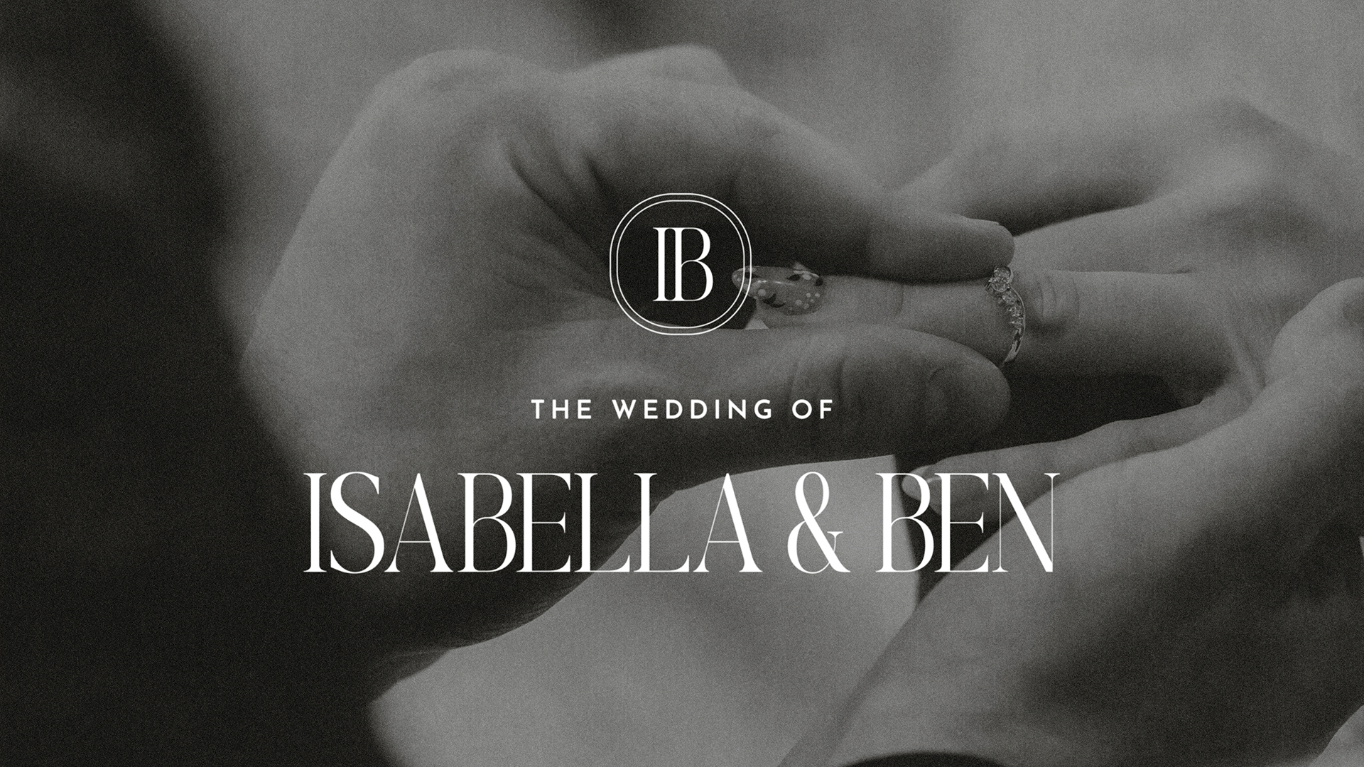
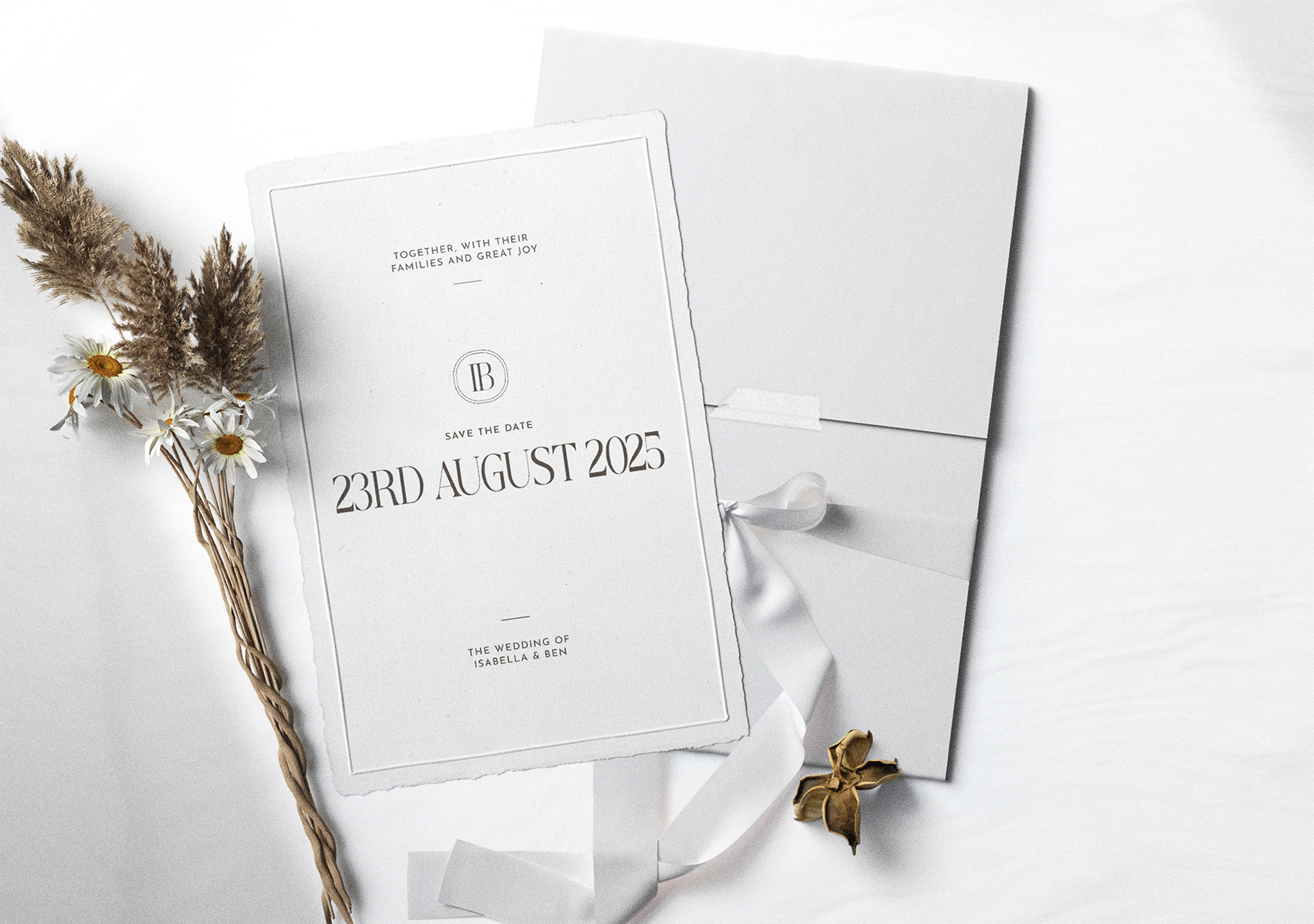
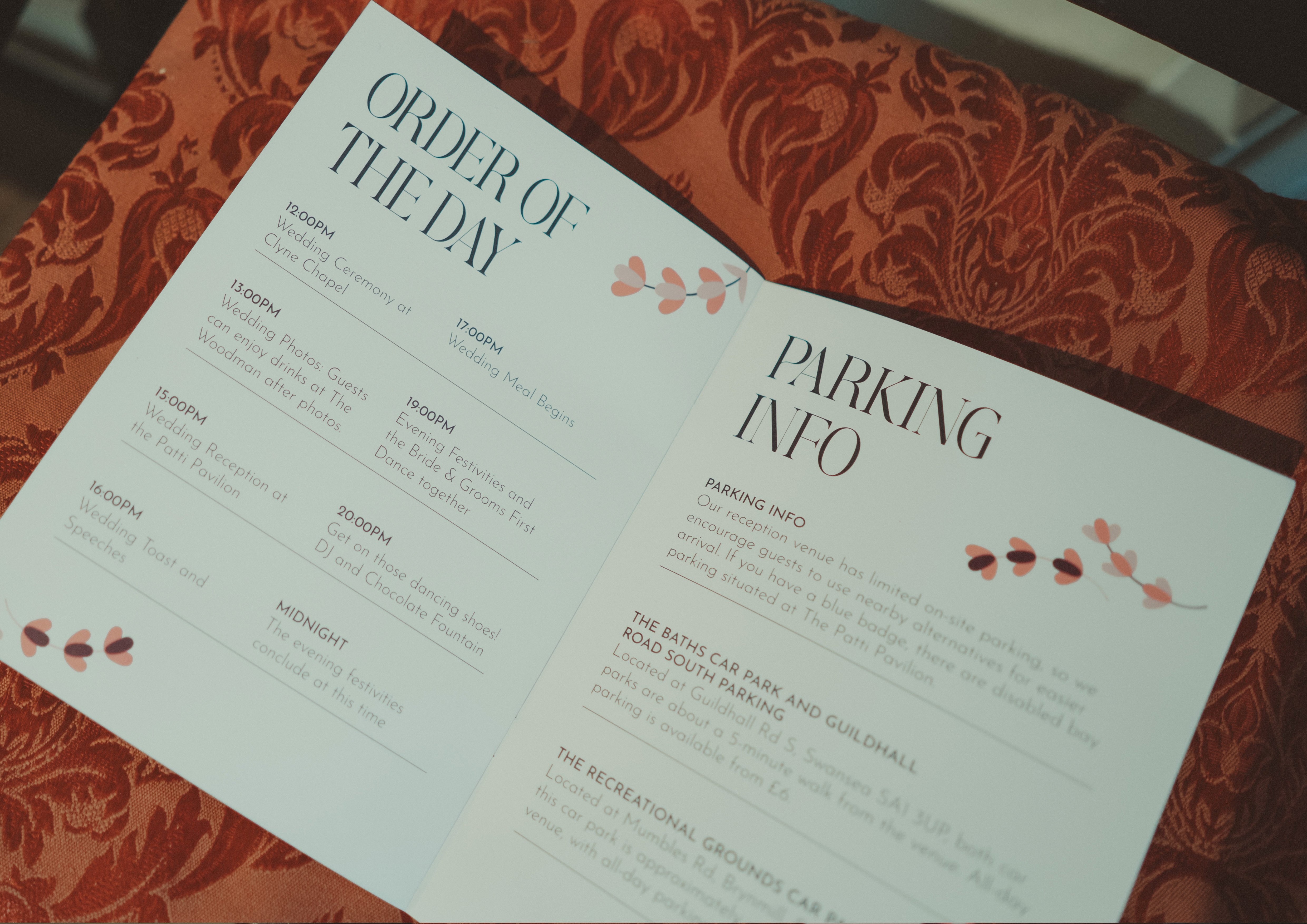
Isabella and Ben’s wedding was planned as an intimate celebration for 86 guests, with several key moments spread across the day. The brief was more than just a visual identity system rooted in a romantic summer garden aesthetic. It needed to help guests understand how the day would unfold, from the ceremony through to the reception.
Planning a wedding can feel overwhelming, and knowing where to start is often the biggest challenge. With 86+ guests and the needs of the couple to consider, this brief focuses on designing a wedding visual system that feels personal, accessible, and welcoming, ensuring that every detail supports clear communication while celebrating the couple’s story with their closest friends and family.
This approach focuses on prioritising information design so that the experience feels welcoming and seamless, where clarity becomes part of the aesthetic.
Clarity first: Key information is easy to scan and understand at a glance.
Progressive disclosure: Details revealed at the right moment across different touchpoints
Consistent hierarchy: Predictable patterns to reduce cognitive load
Elegant restraint: A refined visual tone is maintained without compromising usability
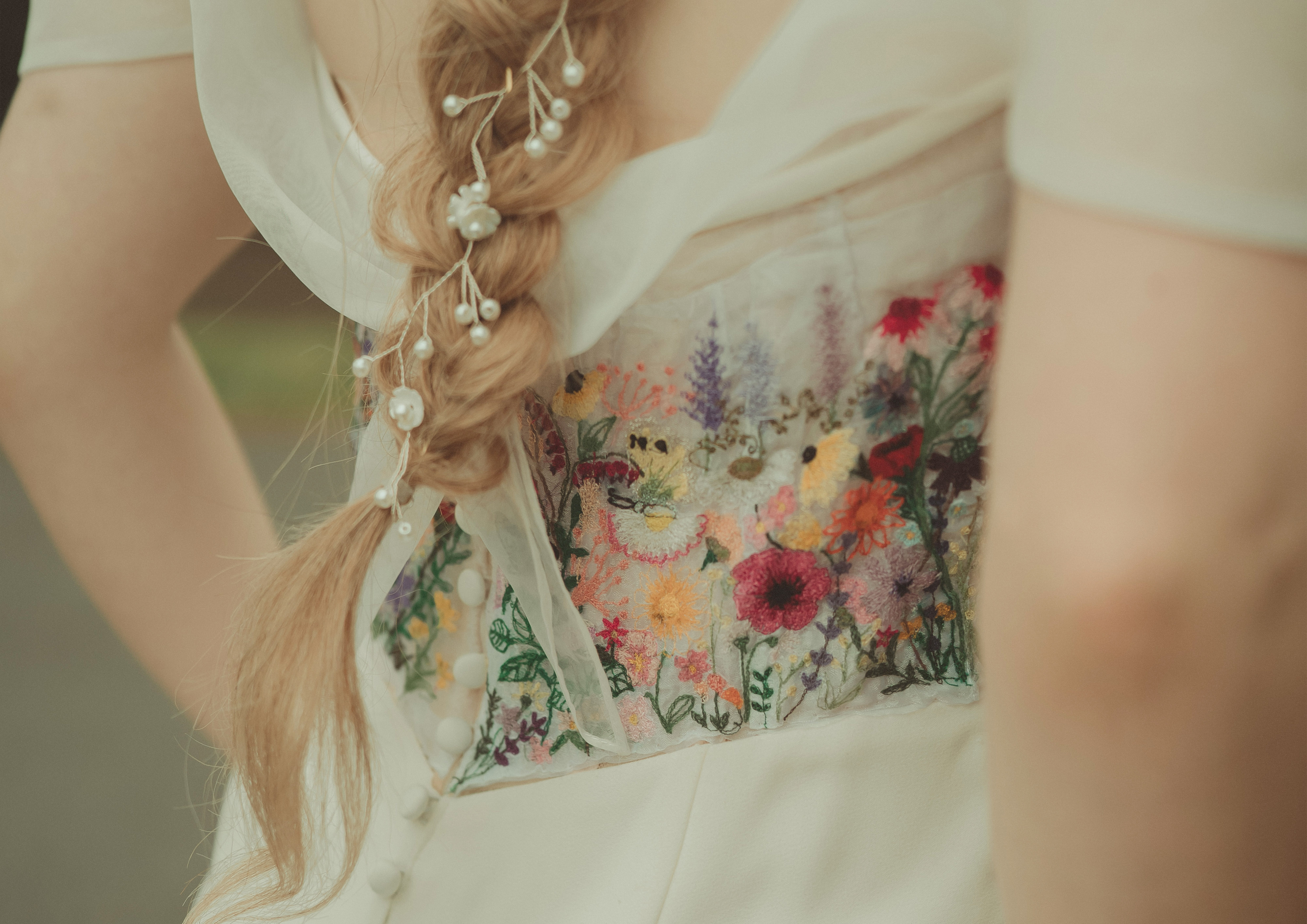
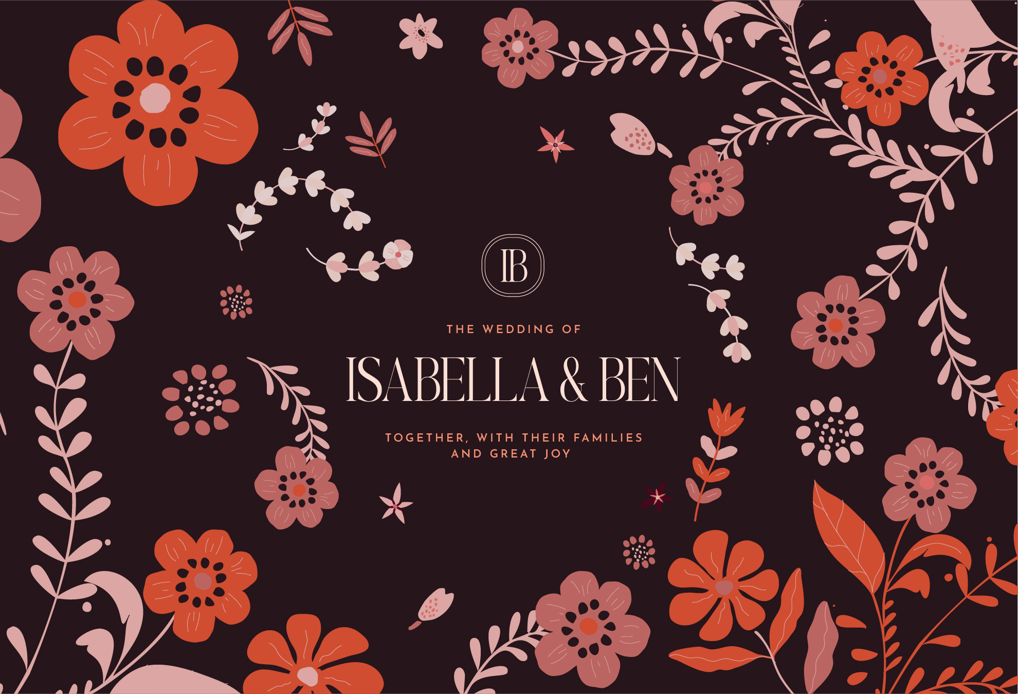
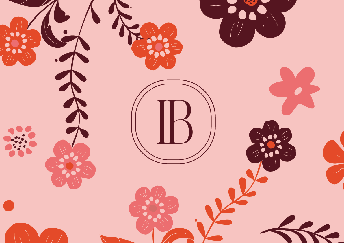
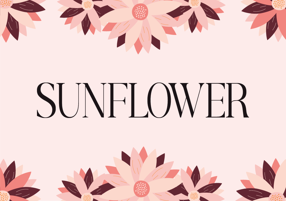
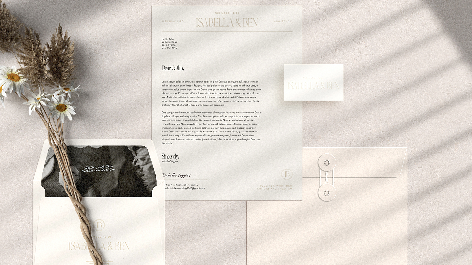
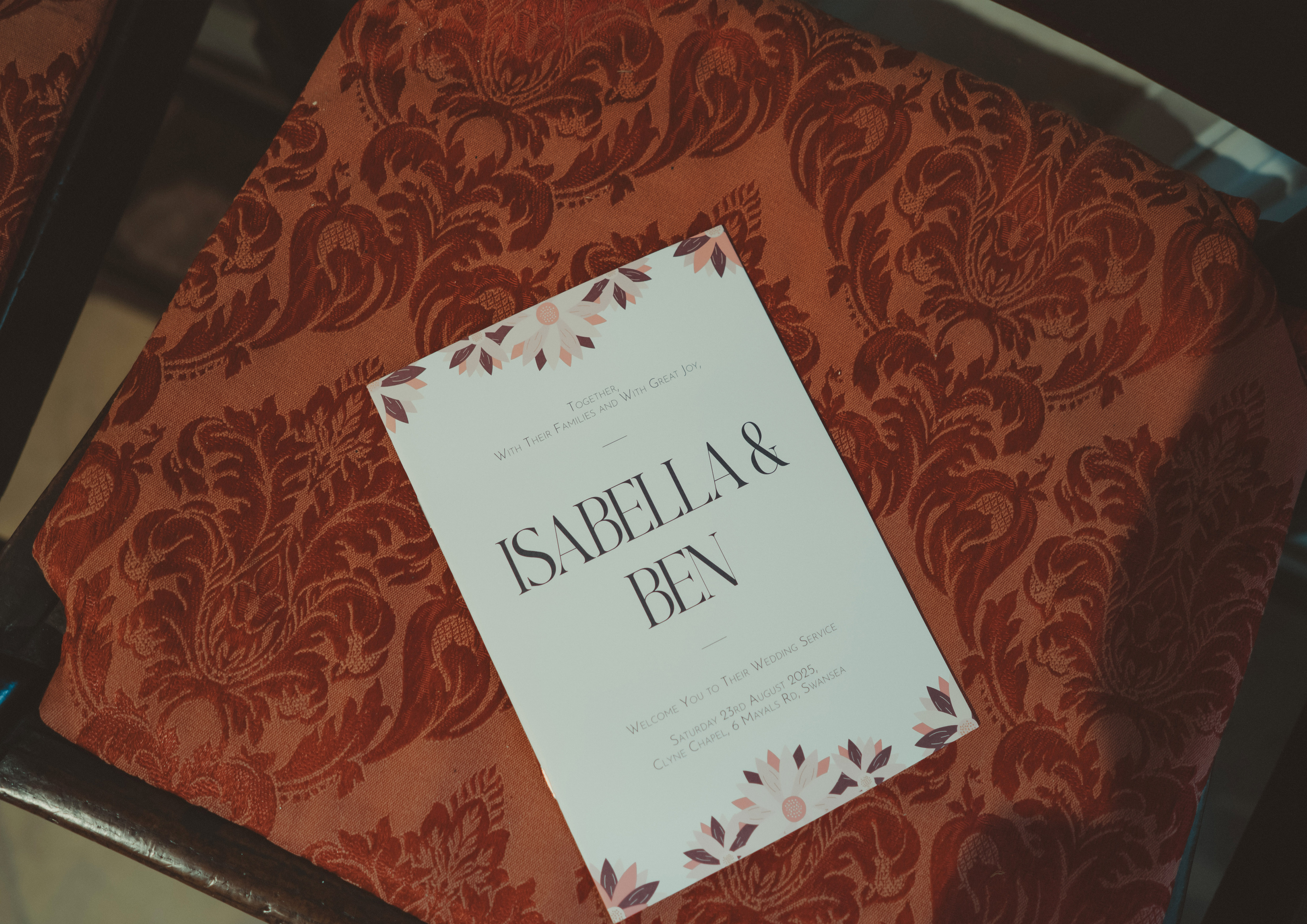
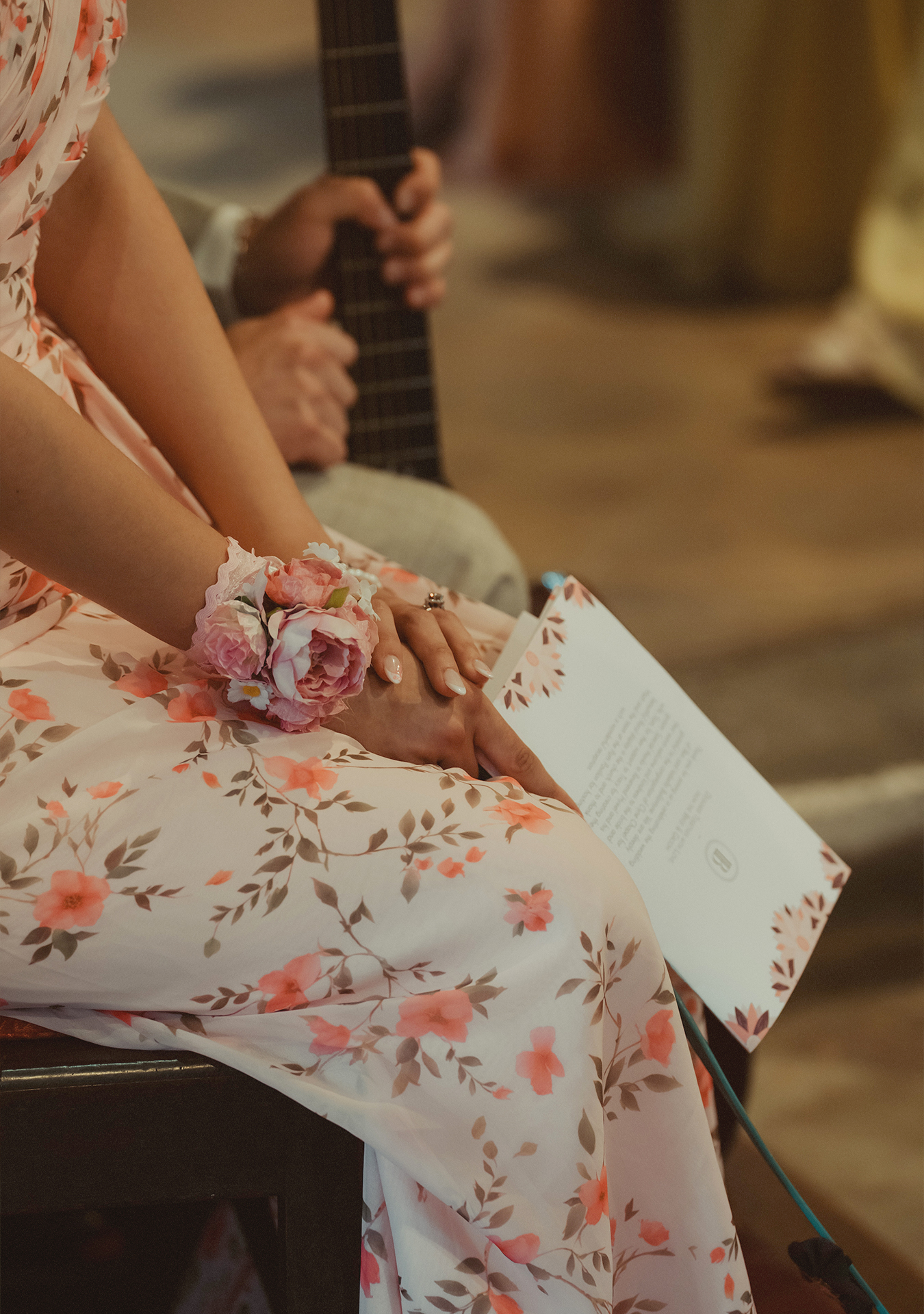
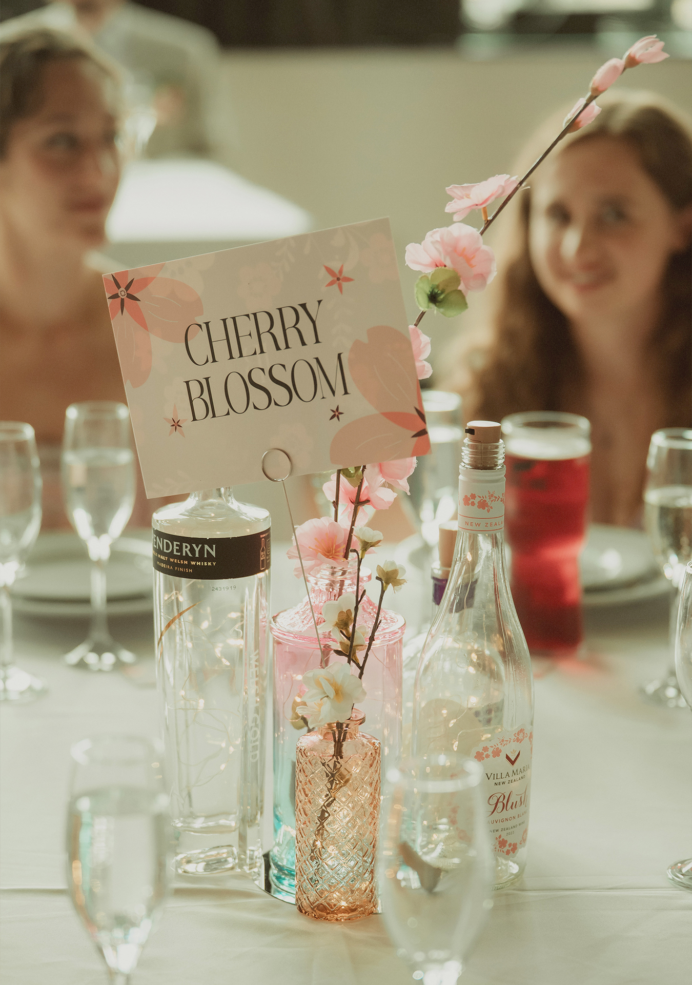
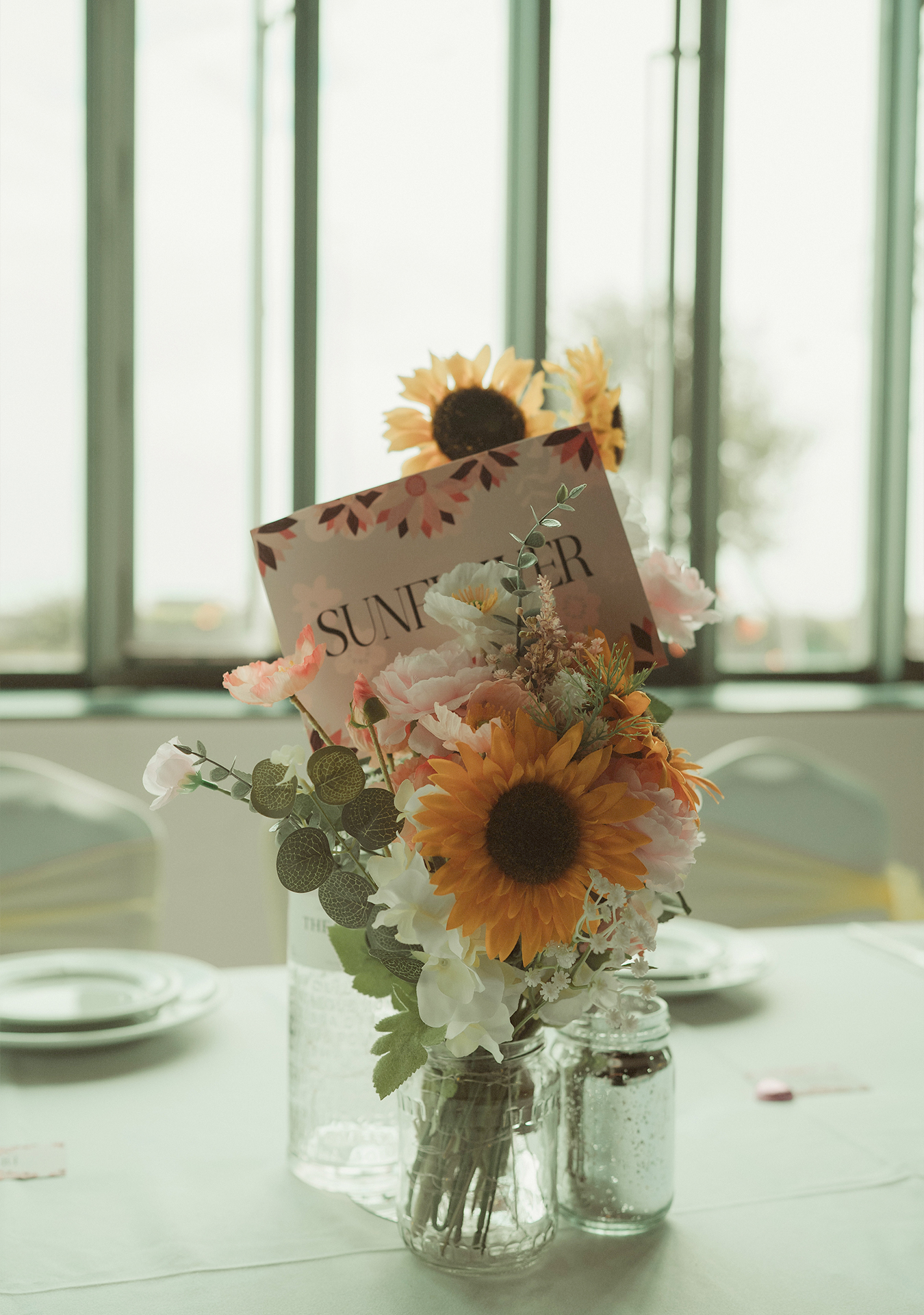
A summer garden aesthetic shaped the art direction, drawing on the flowery season and church setting to balance timeless elegance with modern playfulness. A palette of deep summer tones, flowery illustrations paired with a romantic typography system tied everything together in harmony, echoing the season and bridal party.
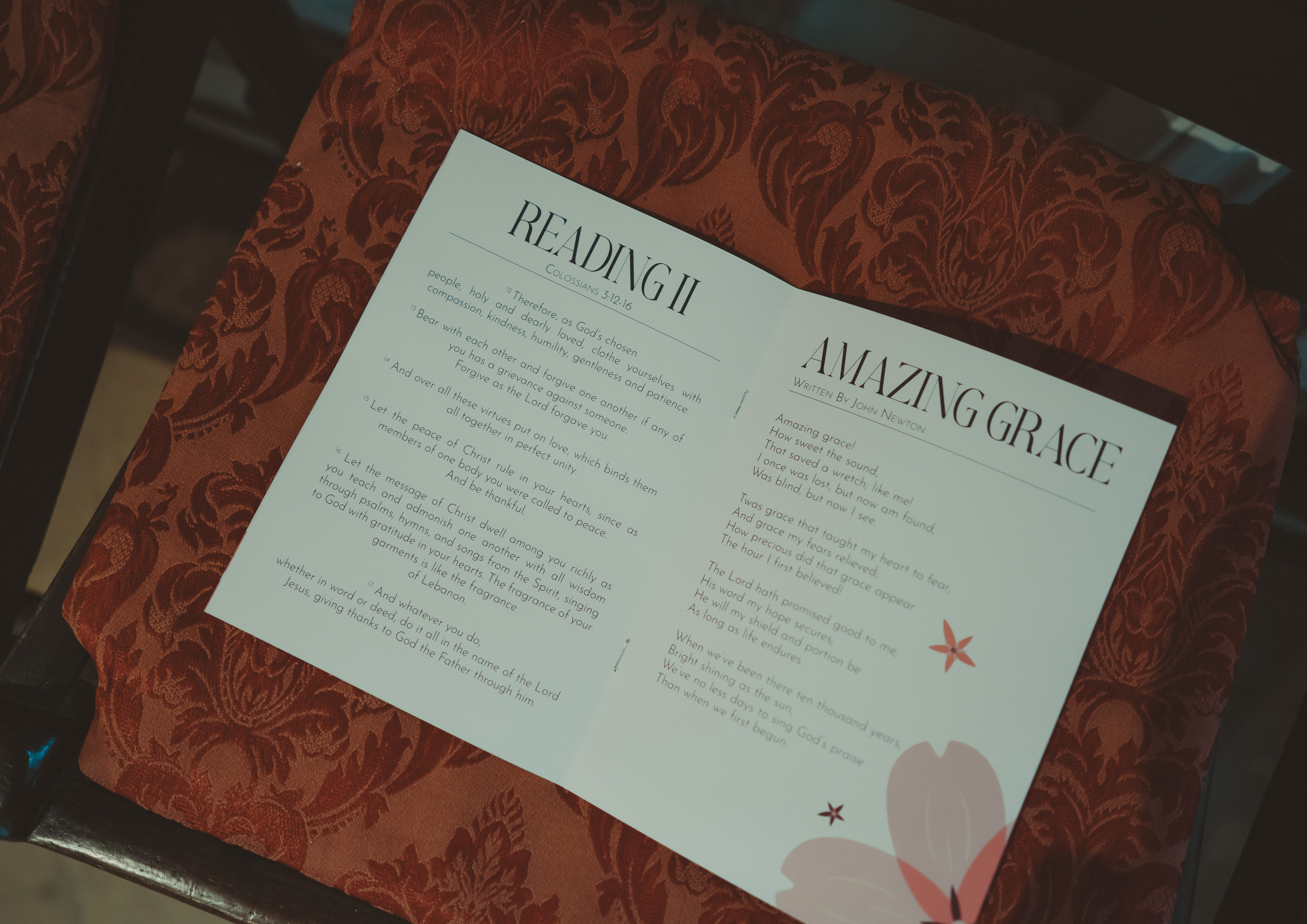
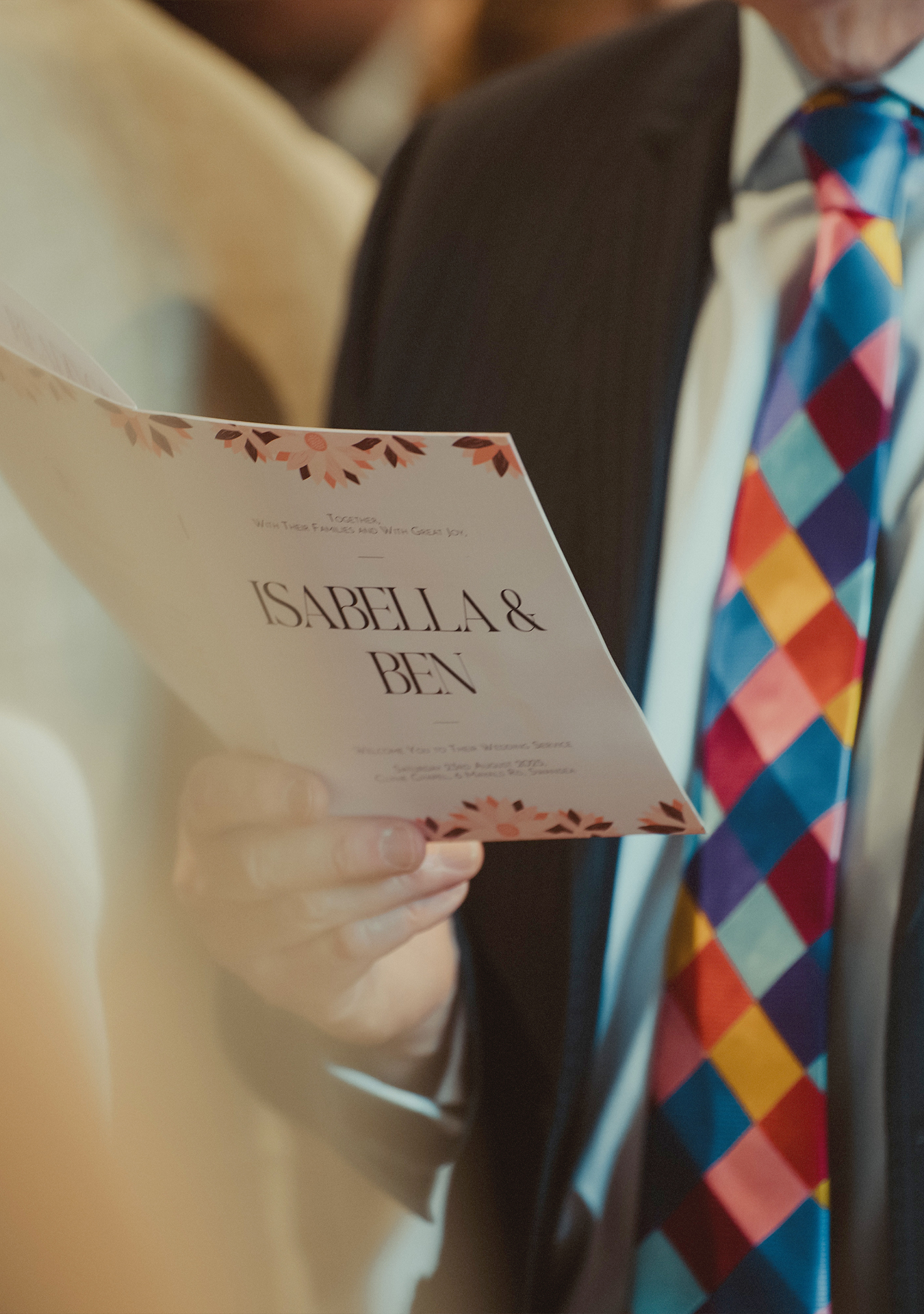
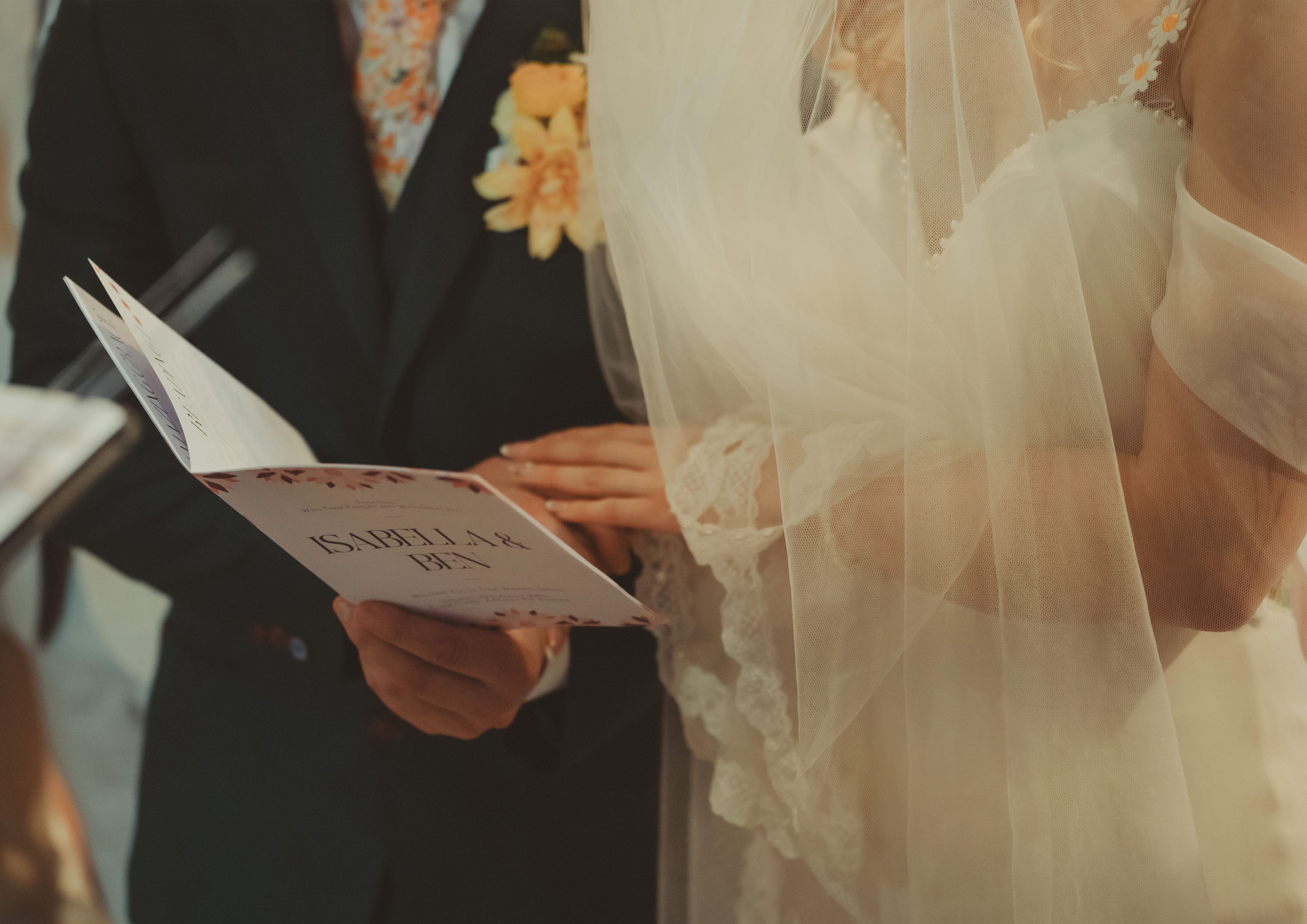
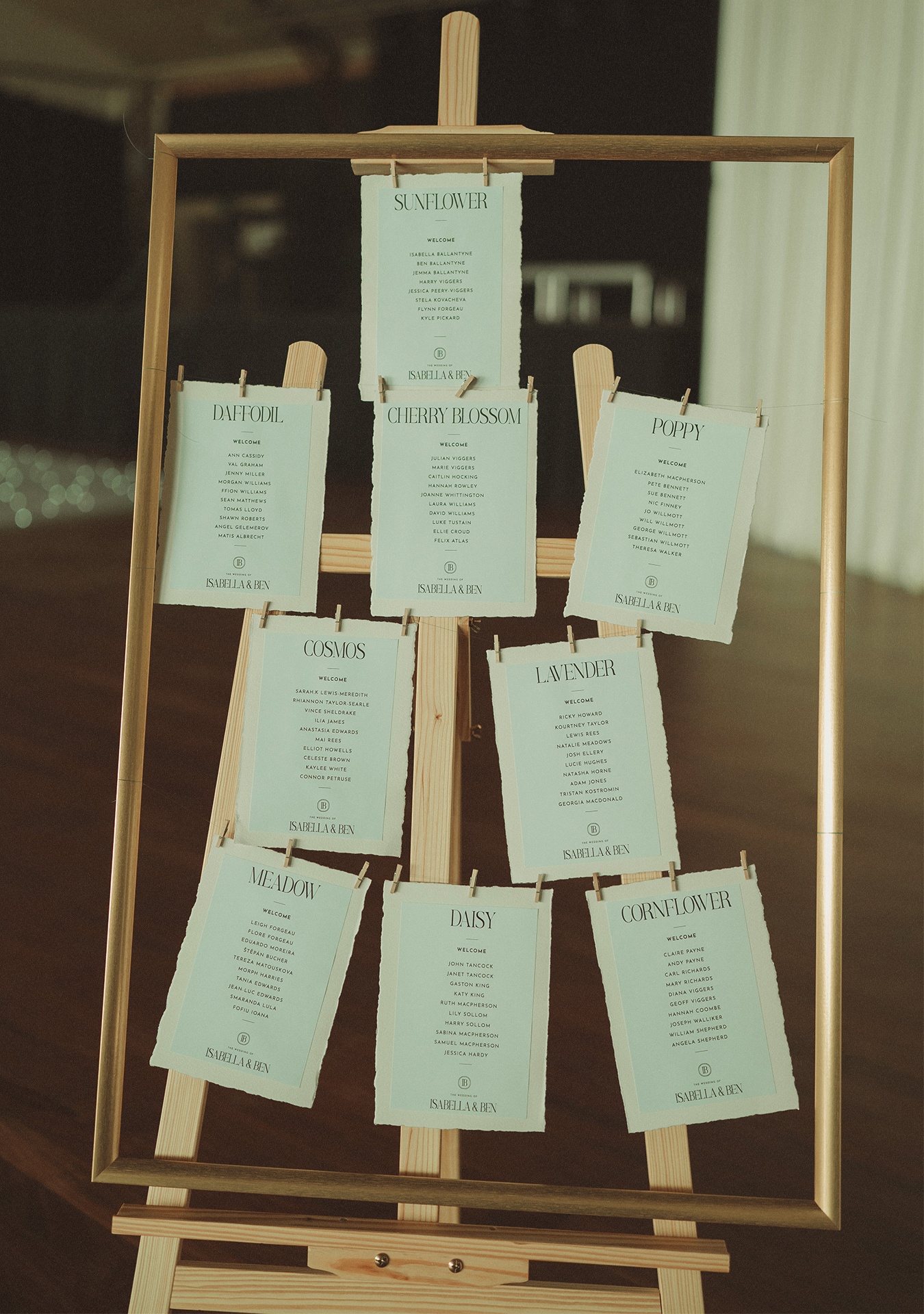
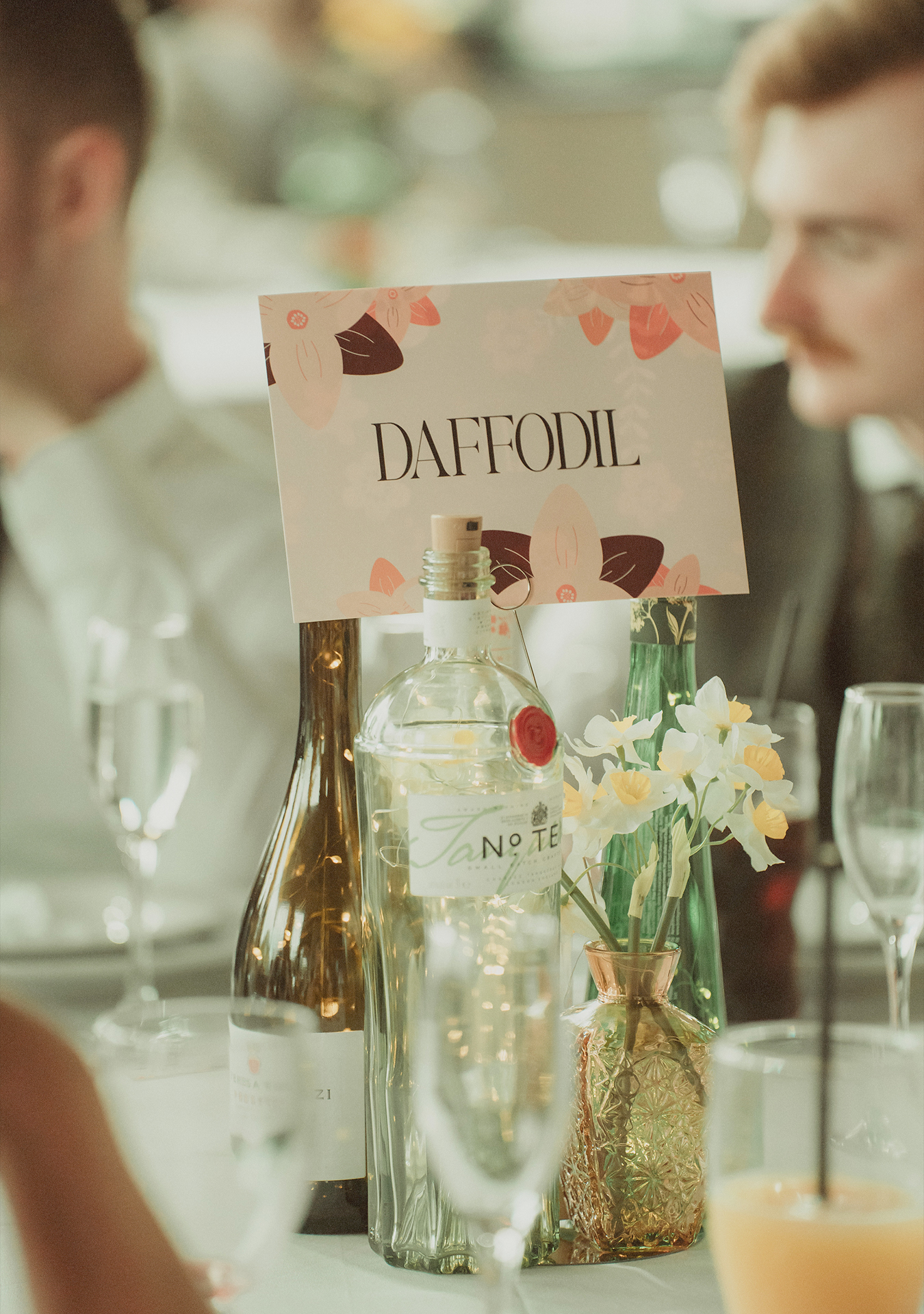
From save-the-date to RSVP, car park to church, ceremony to reception, entrance to dancefloor, everything speaks the same language. Soft florals, summer palettes, romantic typography. A visual system applied consistently, across every touchpoint. Invites, signage, menus, digital details, all connected through one cohesive approach.
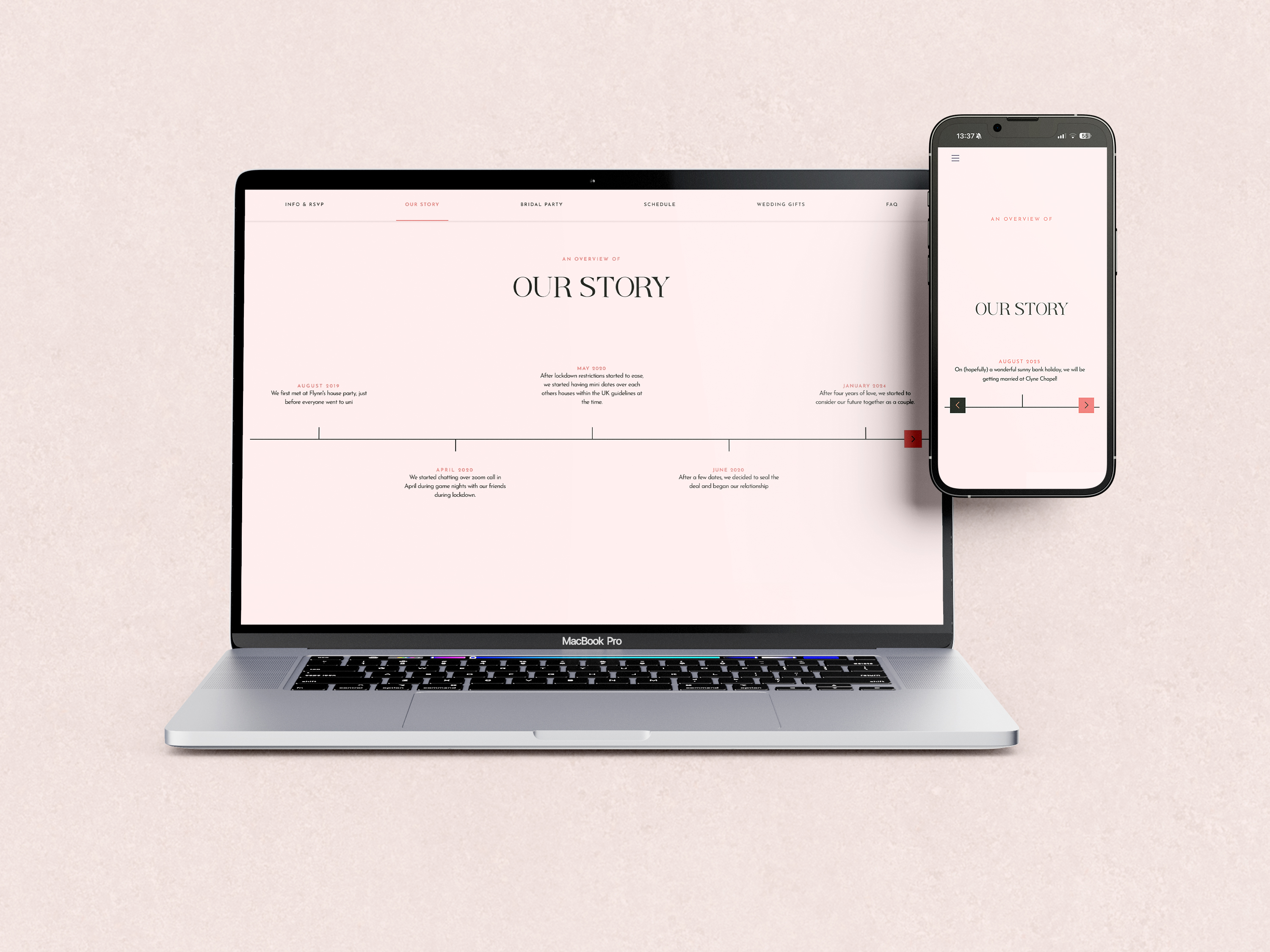
Isabella and Ben's journey began with a simple connection that grew into something extraordinary. From shared moments to unforgettable milestones, every step has led them here.
Services
Logo | Branding & Art Direction | UX | Animation | Print
Sectors
Wedding | Event Production | Digital Media
The Client
Isabella & Ben, and their guests | Swansea, South Wales, UK
The Team
Ben Ballantyne, Lead Creative Designer & Art Director | Lufu Weddings, Photography & Videography
Isabella and Ben’s wedding was planned as an intimate celebration for 86 guests, with several key moments spread across the day. The brief was more than just a visual identity system rooted in a romantic summer garden aesthetic. It needed to help guests understand how the day would unfold, from the ceremony through to the reception.

Planning a wedding can feel overwhelming, and knowing where to start is often the biggest challenge. With 86+ guests and the needs of the couple to consider, this brief focuses on designing a wedding visual system that feels personal, accessible, and welcoming, ensuring that every detail supports clear communication while celebrating the couple’s story with their closest friends and family.
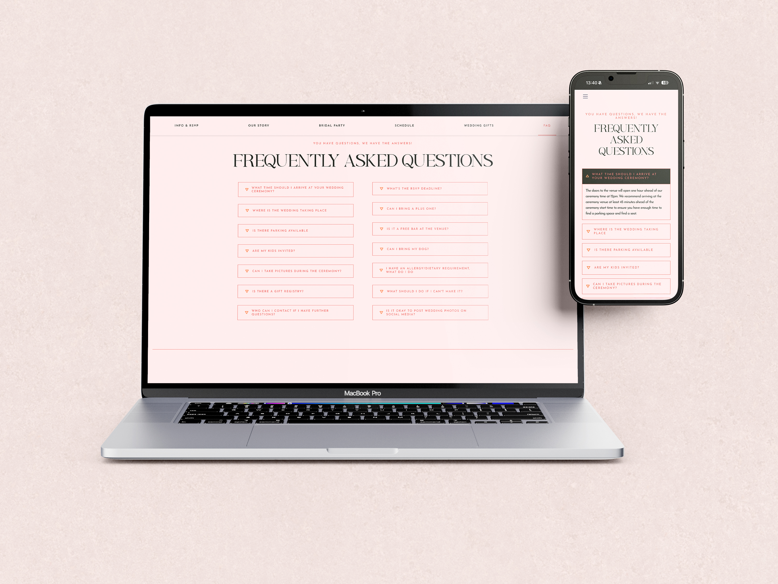
Weddings often prioritises decoration over communication, leaving our guests to be unsure or overwhelmed. This approach focused on making information welcoming, accessible, and easy to navigate.
Clarity first: Key information is easy to scan and understand at a glance.
Progressive disclosure: Details revealed at the right moment across different touchpoints
Consistent hierarchy: Predictable patterns to reduce cognitive load
Elegant restraint: A refined visual tone is maintained without compromising usability.
By prioritising information design, the experience could feel both seamless and considered, where clarity itself becomes part of the aesthetic.
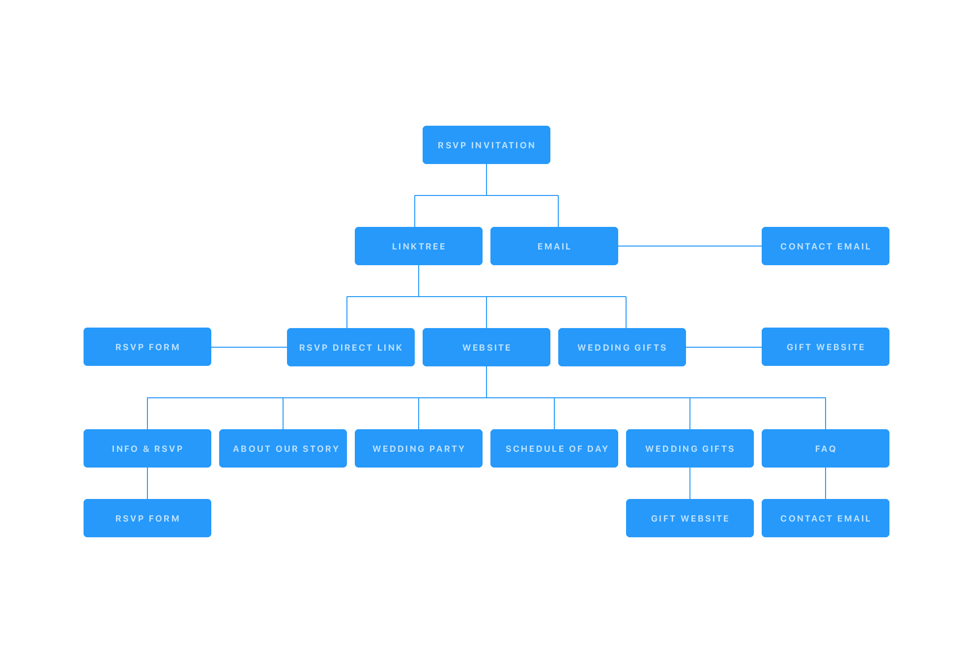
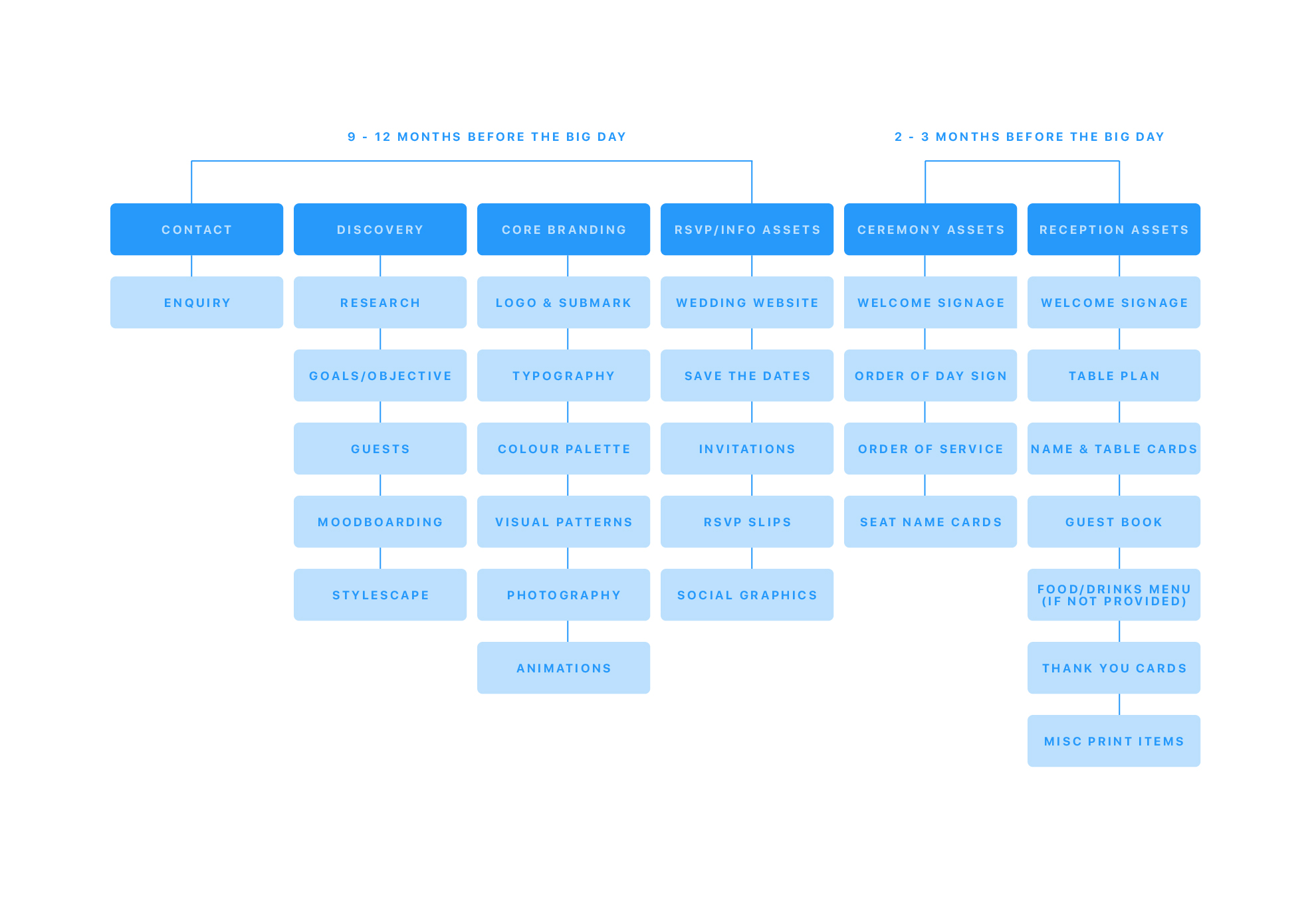
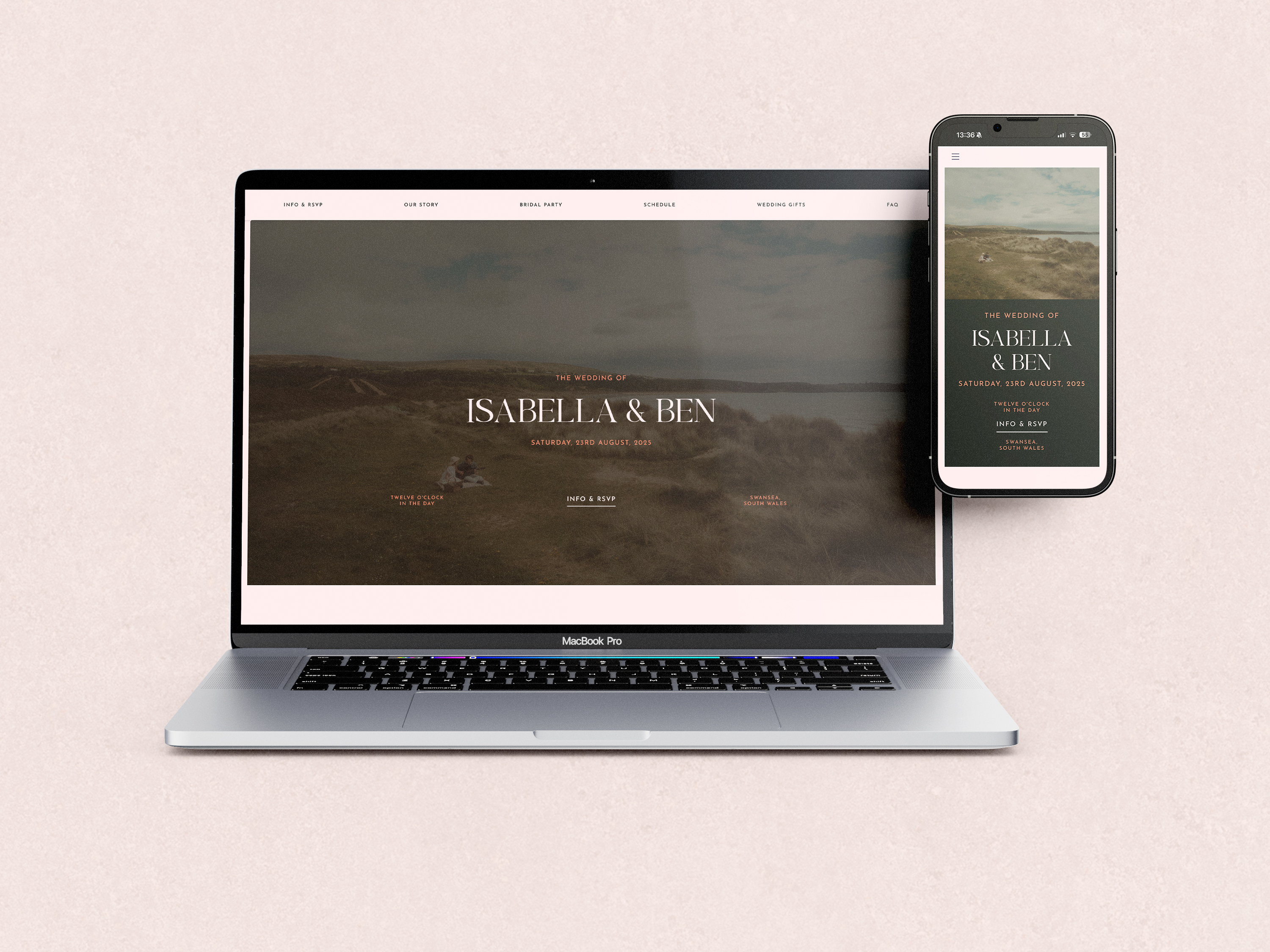
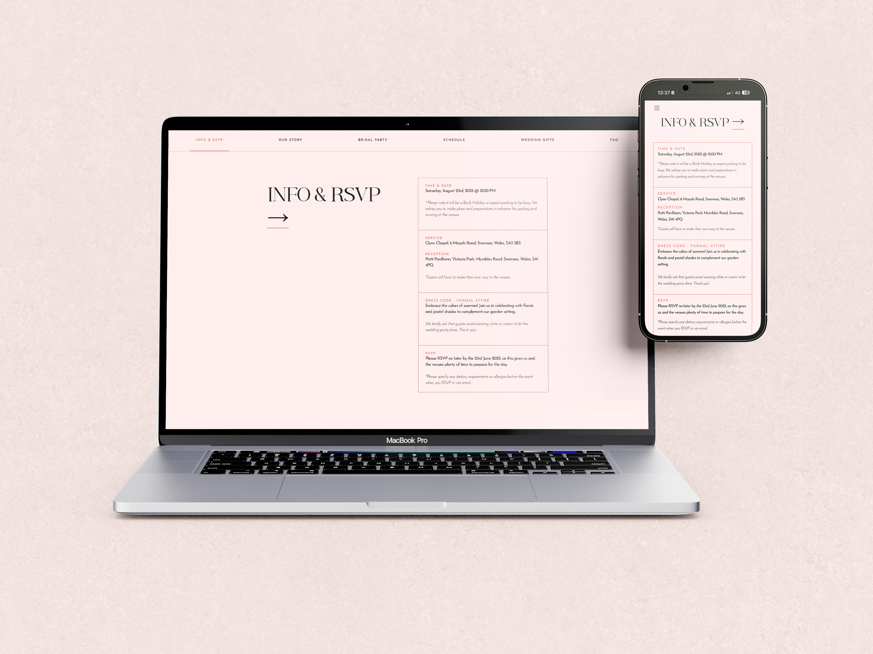
To keep everything clear and easy to navigate, I created a simple structure across both the guest experience and the planning journey. A centralised sitemap brings all the key information together so guests can quickly find what they need without confusion. Alongside this, a 12-month roadmap guides the couple through each stage of the process, helping them understand what to expect and when. Together, this creates a smooth, stress-free experience for everyone involved.
We created a moodboard of florals, summer tones, and warm imagery to define the visual direction early on. To reflect the key insights, we explored floral illustrations and tested typography arrangements across different layouts to shape a visual system that feels both expressive and consistent across every touchpoint.

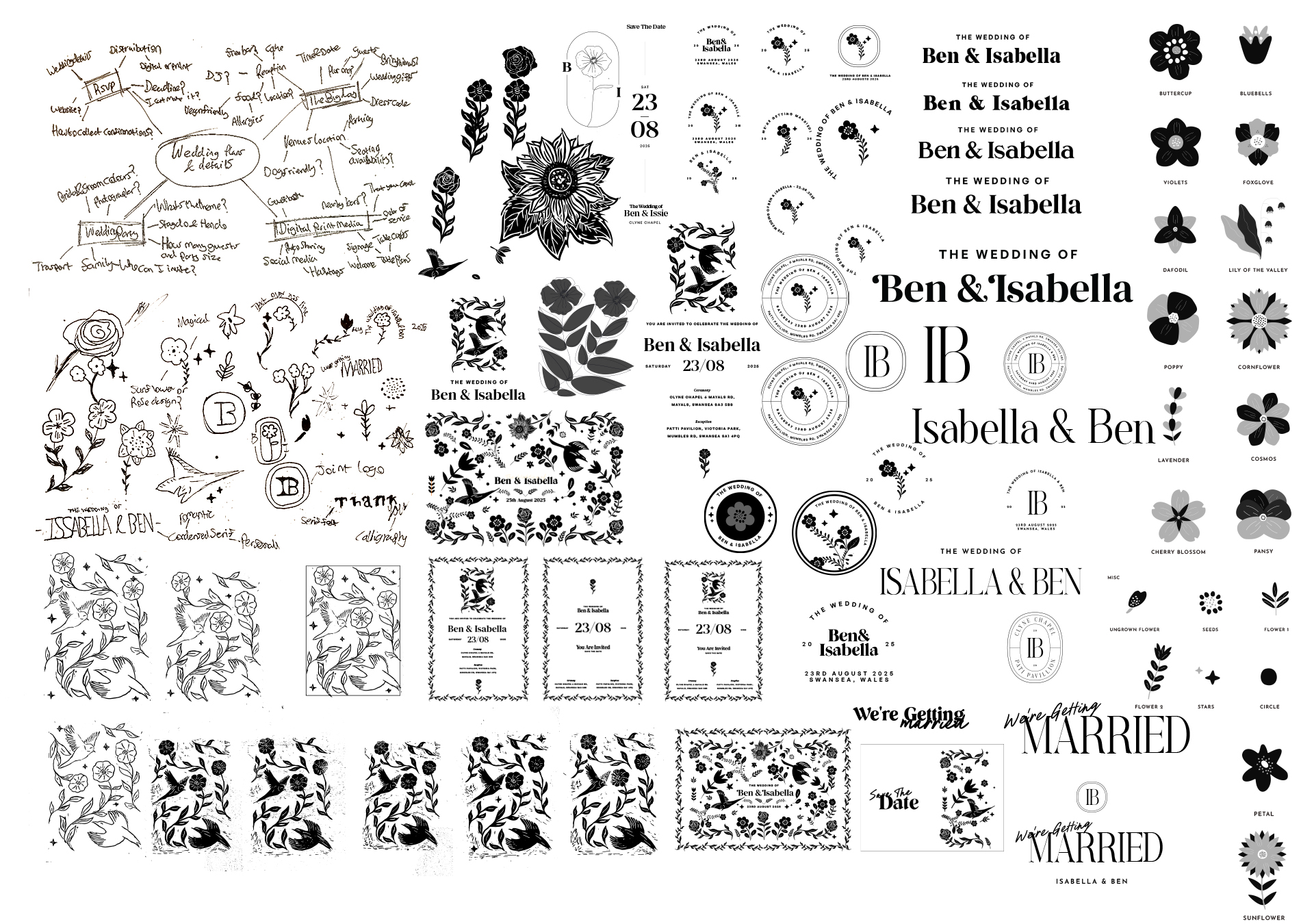
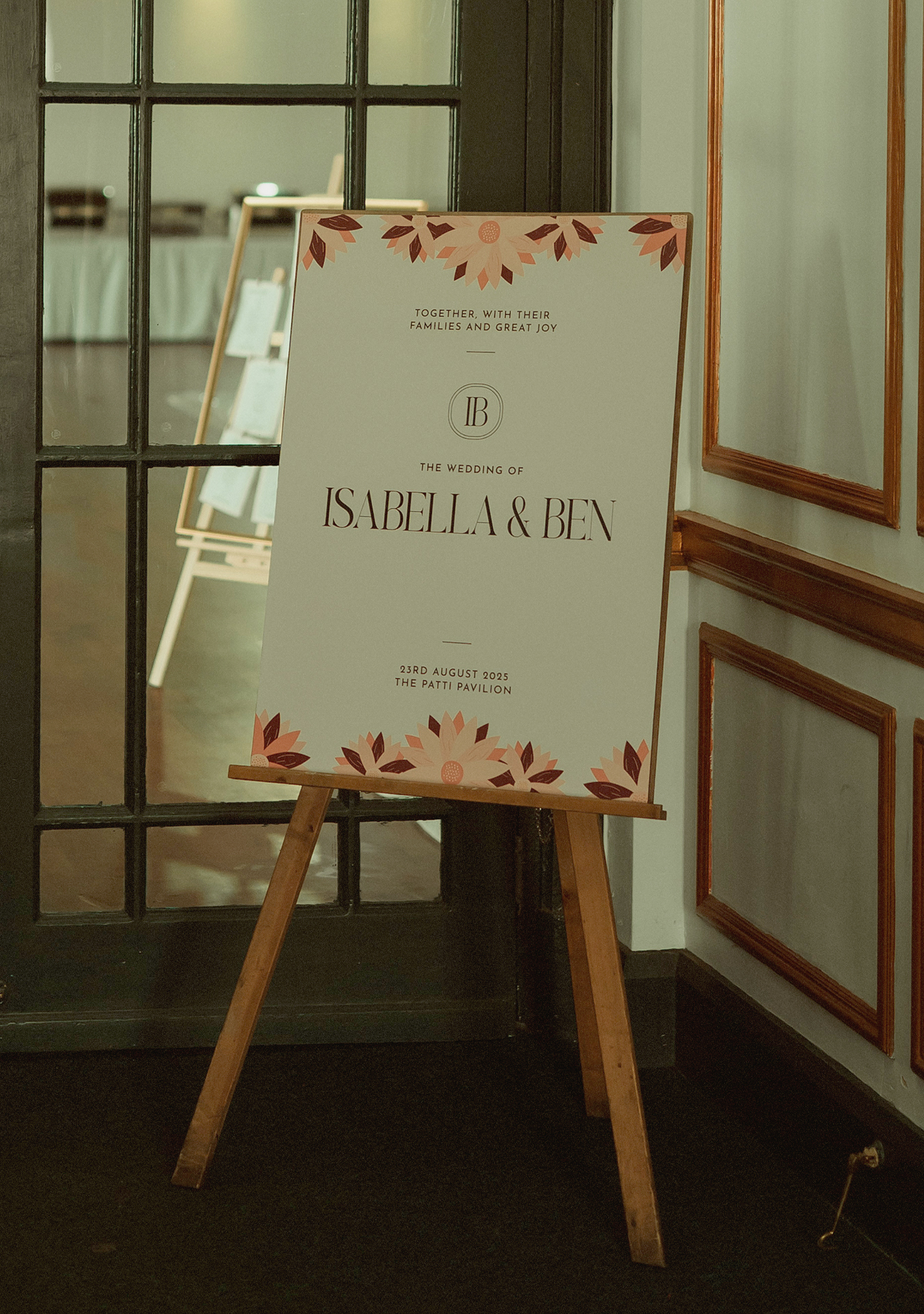
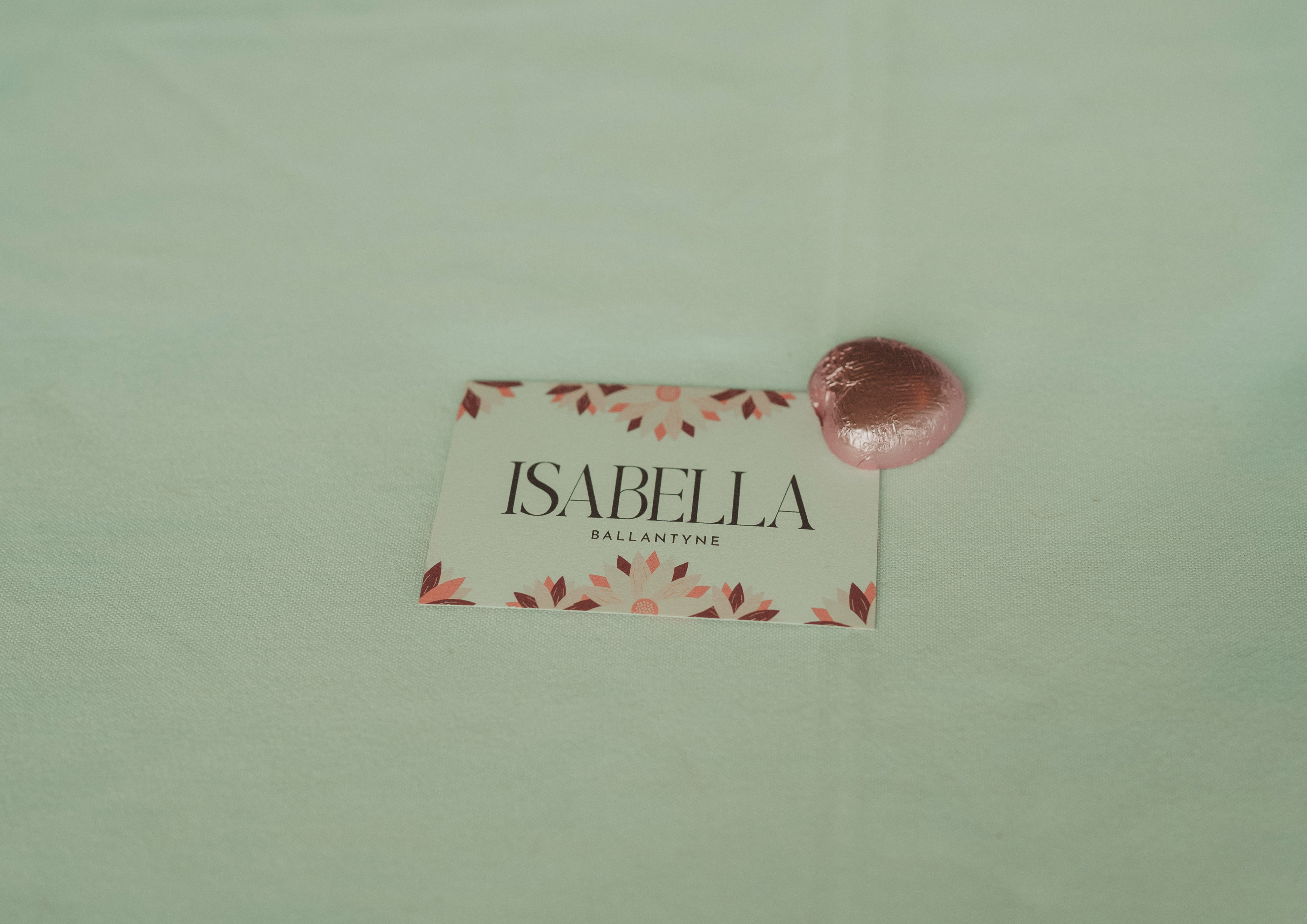
A summer garden aesthetic shaped the art direction, drawing on the flowery season and church setting to balance timeless elegance with modern playfulness. A palette of deep summer tones, flowery illustrations paired with a romantic typography system tied everything together in harmony, echoing the season and bridal party.
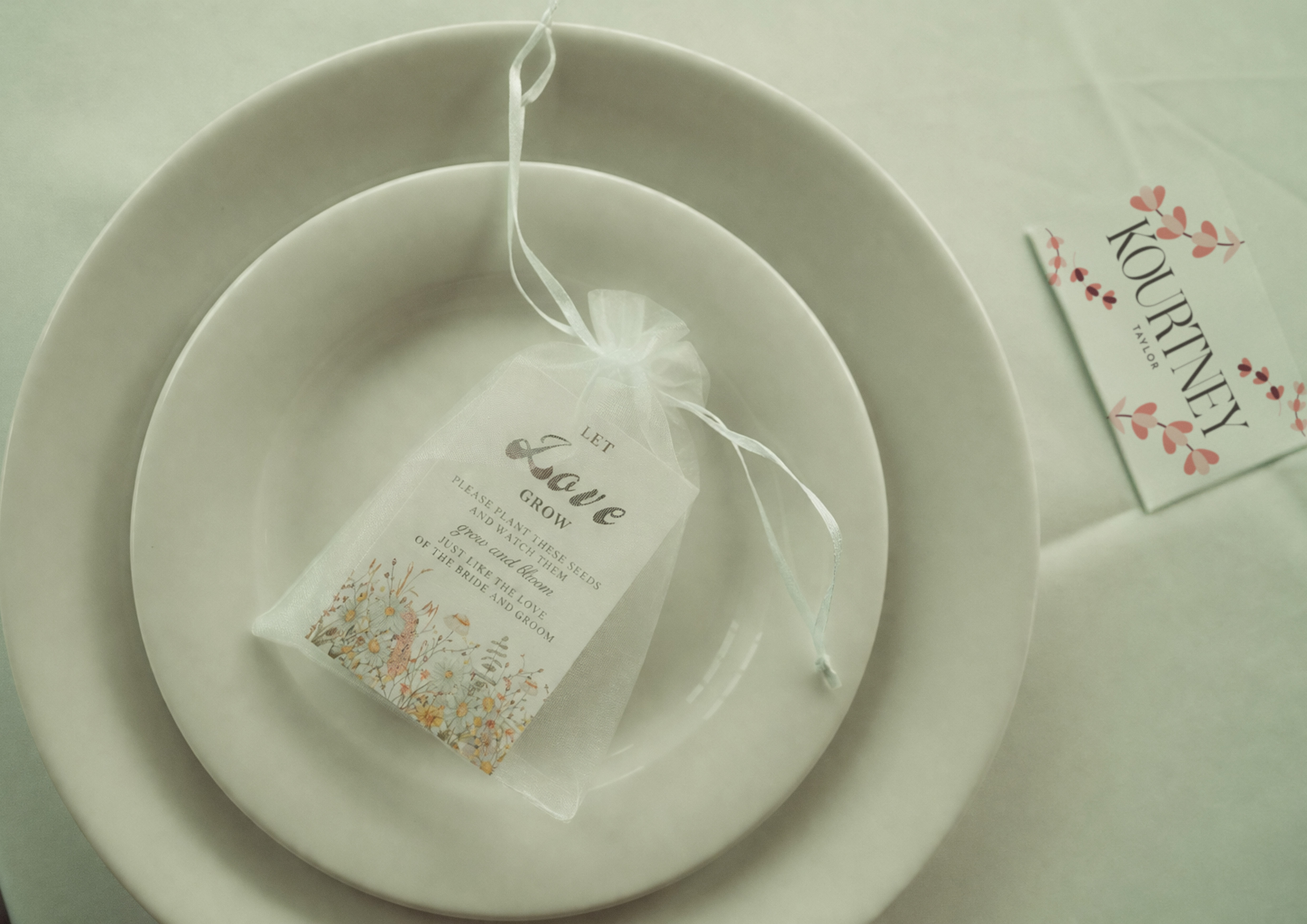
The main logo prioritises legibility, using a typographic system to reflect the couple’s romantic identity while ensuring clear communication for guests. A flexible design system combines typography with floral illustrations, allowing for both expressive and restrained applications depending on the context of each touchpoint.
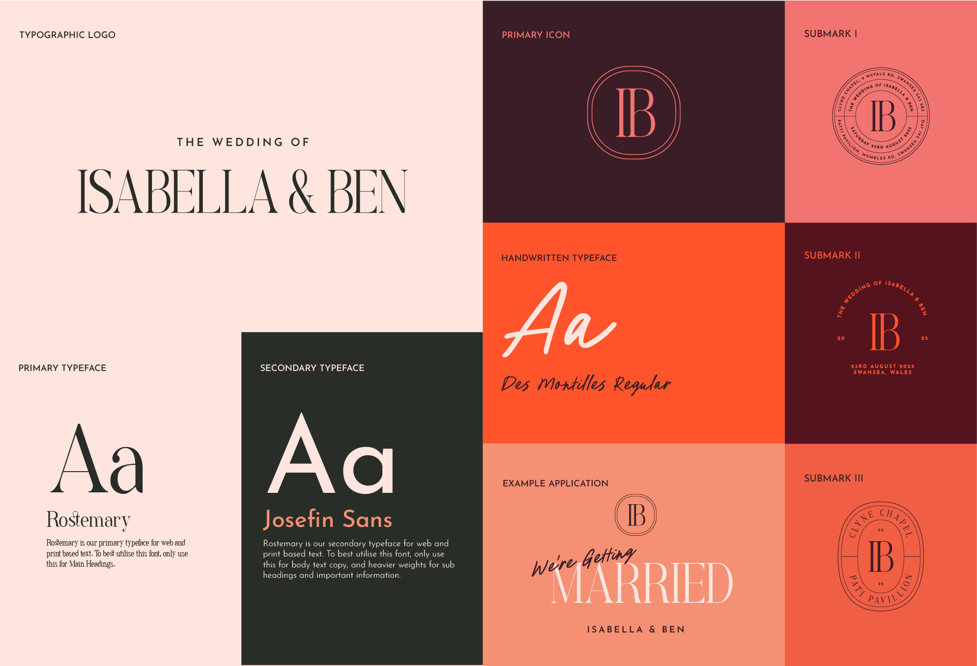
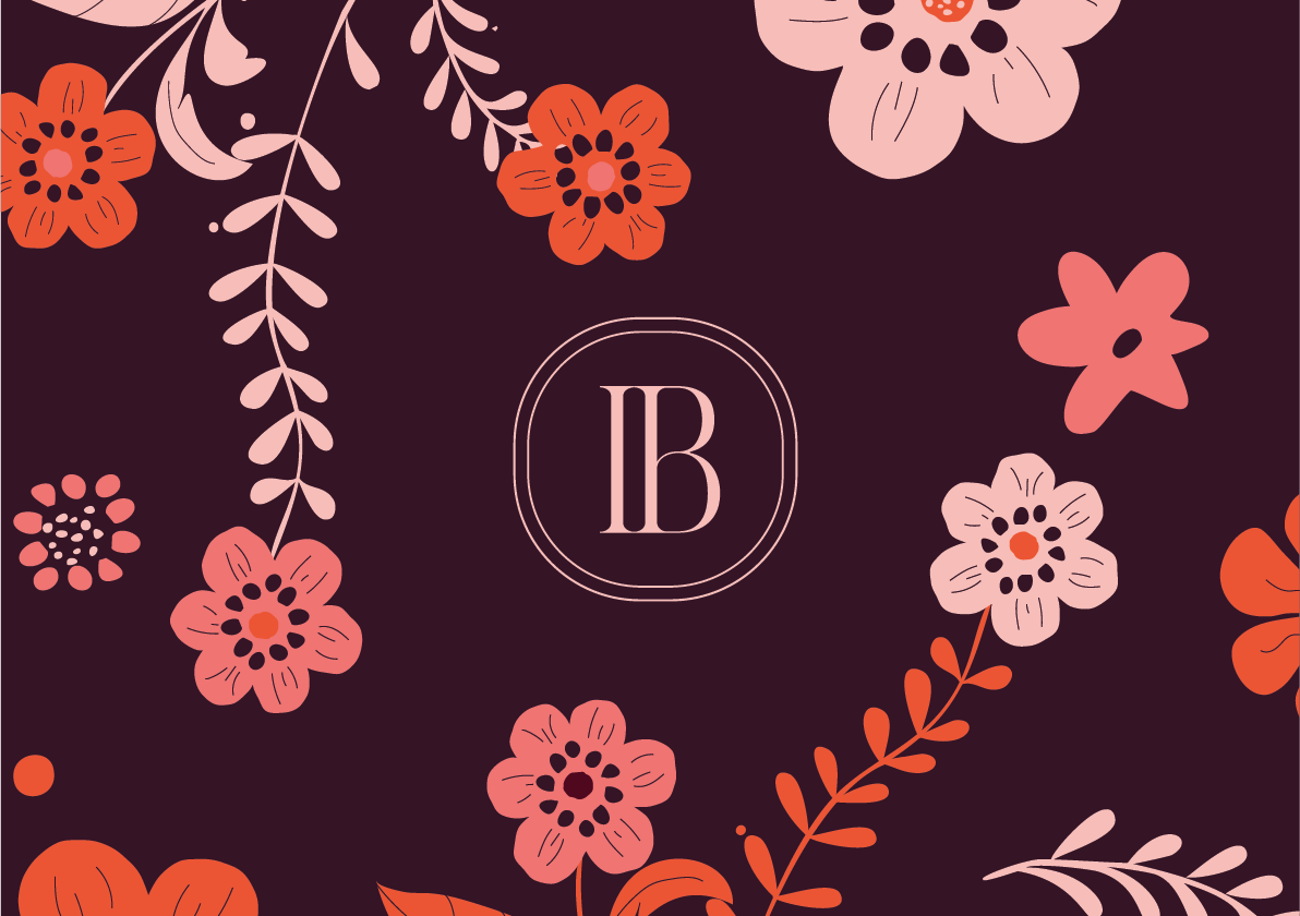


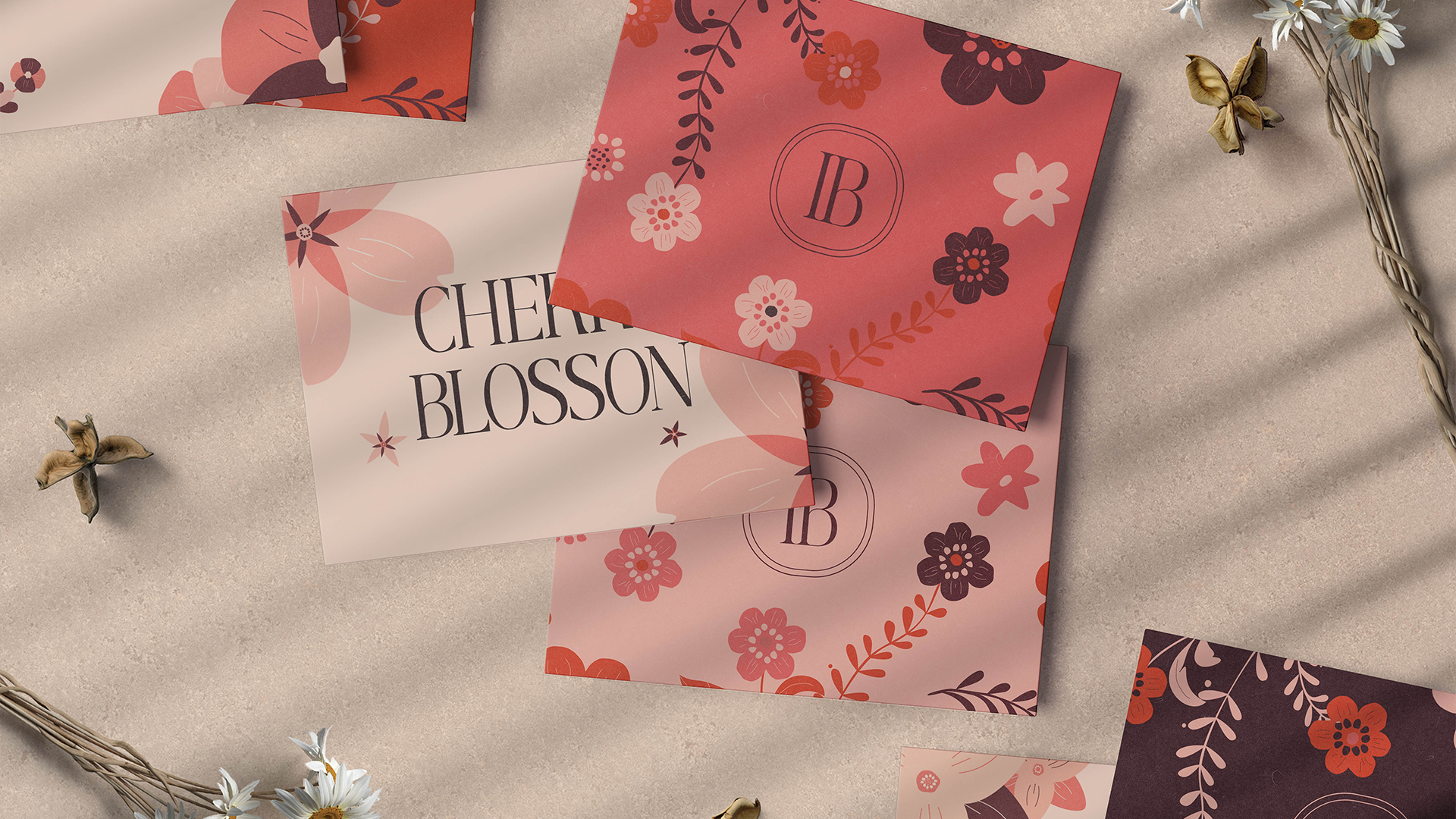
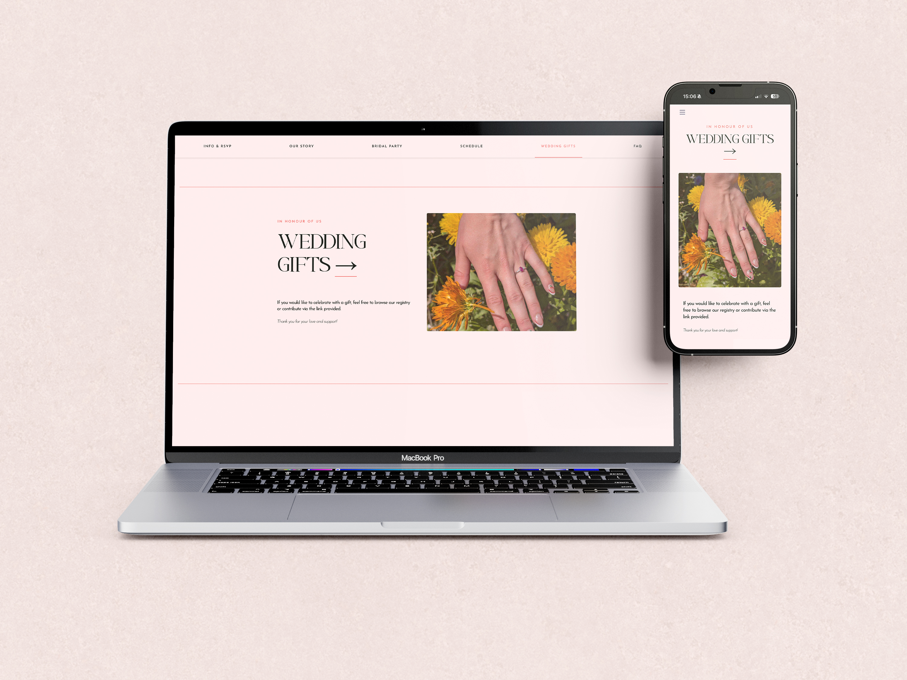
From save-the-date to RSVP, car park to church, ceremony to reception, entrance to dancefloor, everything speaks the same language. Soft florals, summer palettes, romantic typography. A visual system applied consistently, across every touchpoint. Invites, signage, menus, digital details, all connected through one cohesive approach.
The RSVP experience focuses on clarity and accessibility, helping guests move smoothly from invitation to response without unnecessary effort, to make the process as easy as possible. Each step is structured to feel intuitive, ensuring guests always know what to do next.
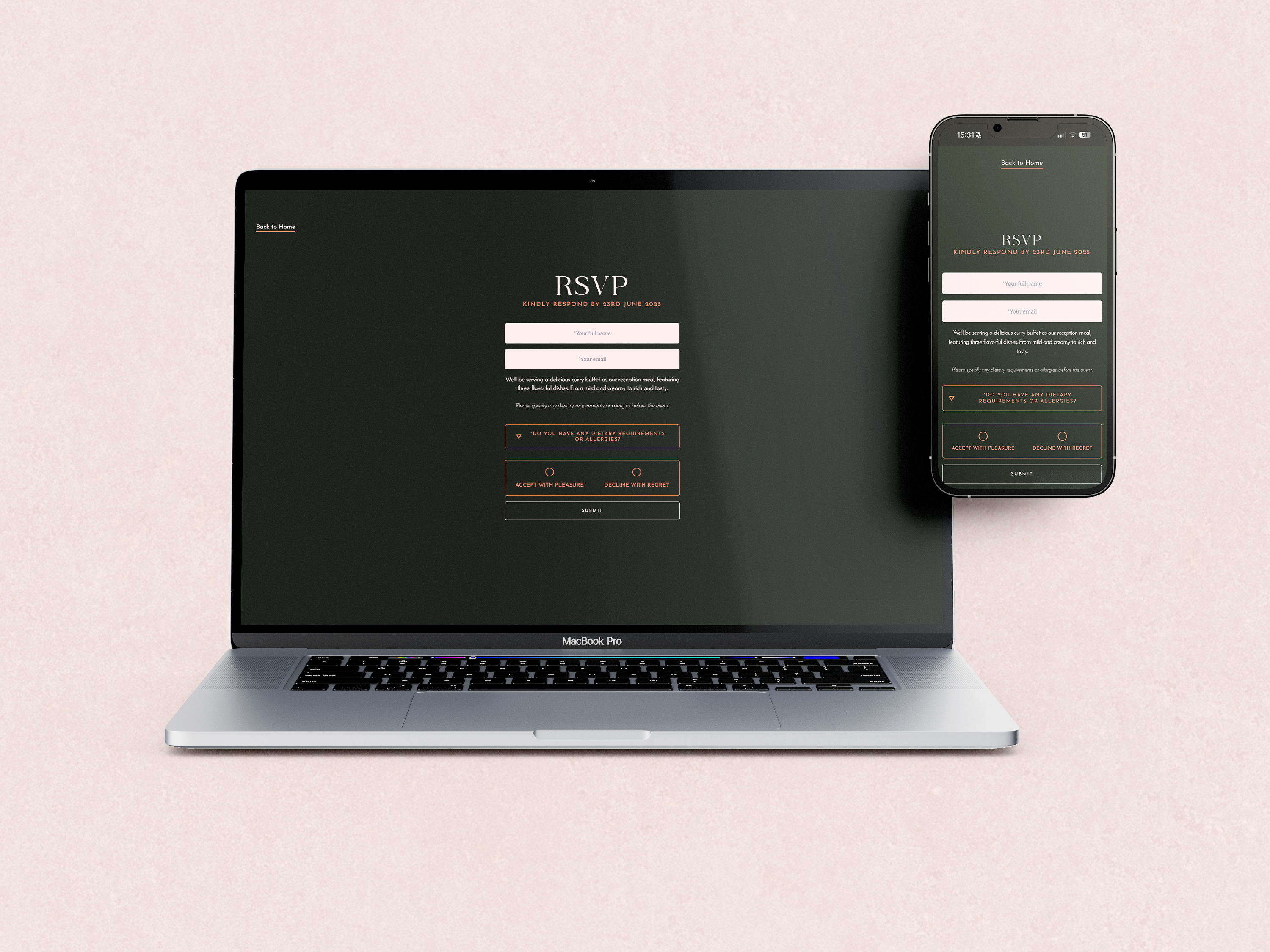
Wherever guests are in the journey, the visual identity helped keep the fragmentation of wedding planning in a unified experience. Guests felt welcomed and confident in making plans ahead of the big day.

All 86 guests were able to respond to the RSVP by the target deadline from its digital and physical distribution.
The visual system was delivered ahead of time within 9 months, all assets to be used.
90% of guests used the wedding website to RSVP and find key information, helping streamline planning in the lead-up to the day.
Creating animation reels that were used as social media assets effectively captured the energy of each track.