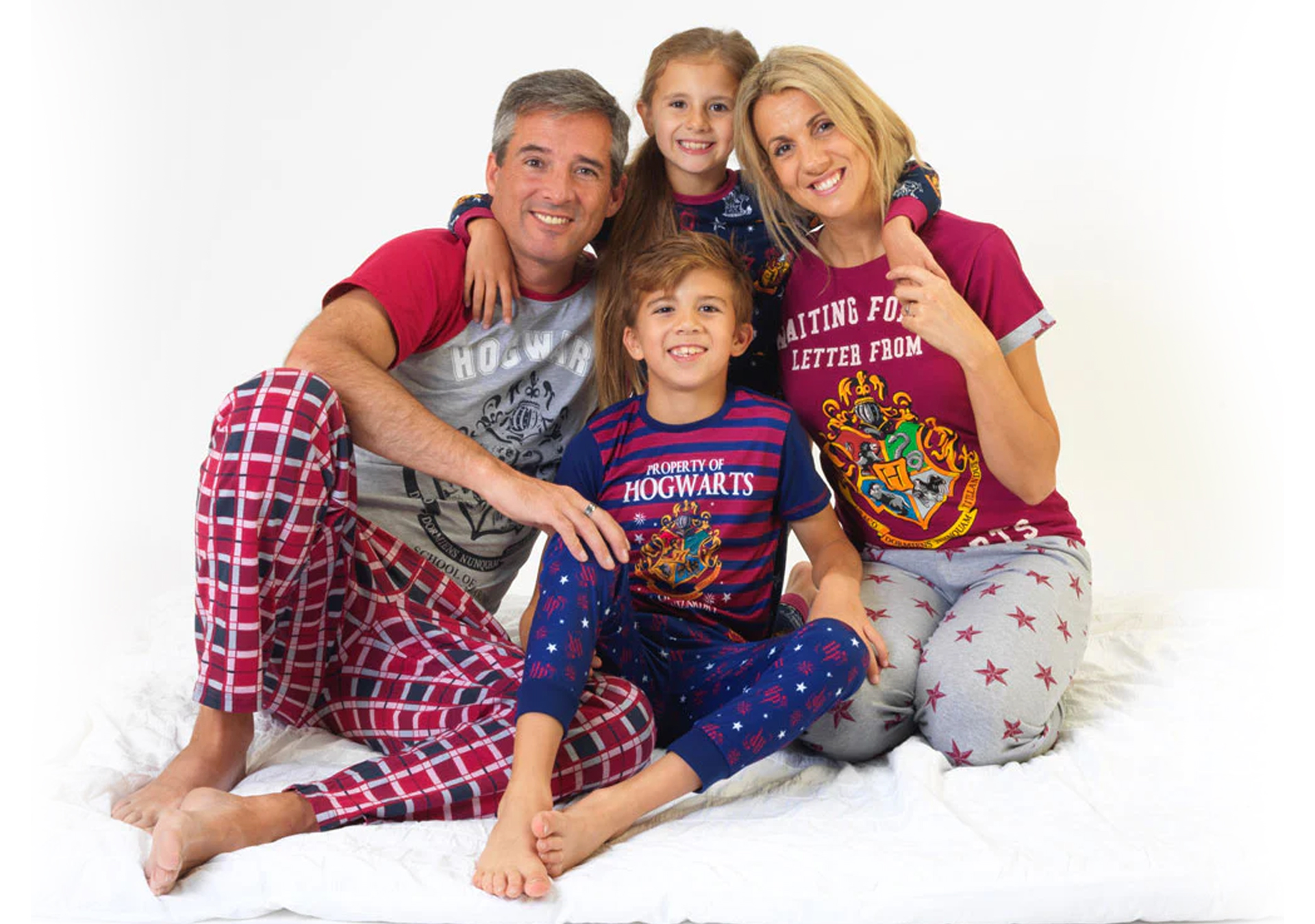
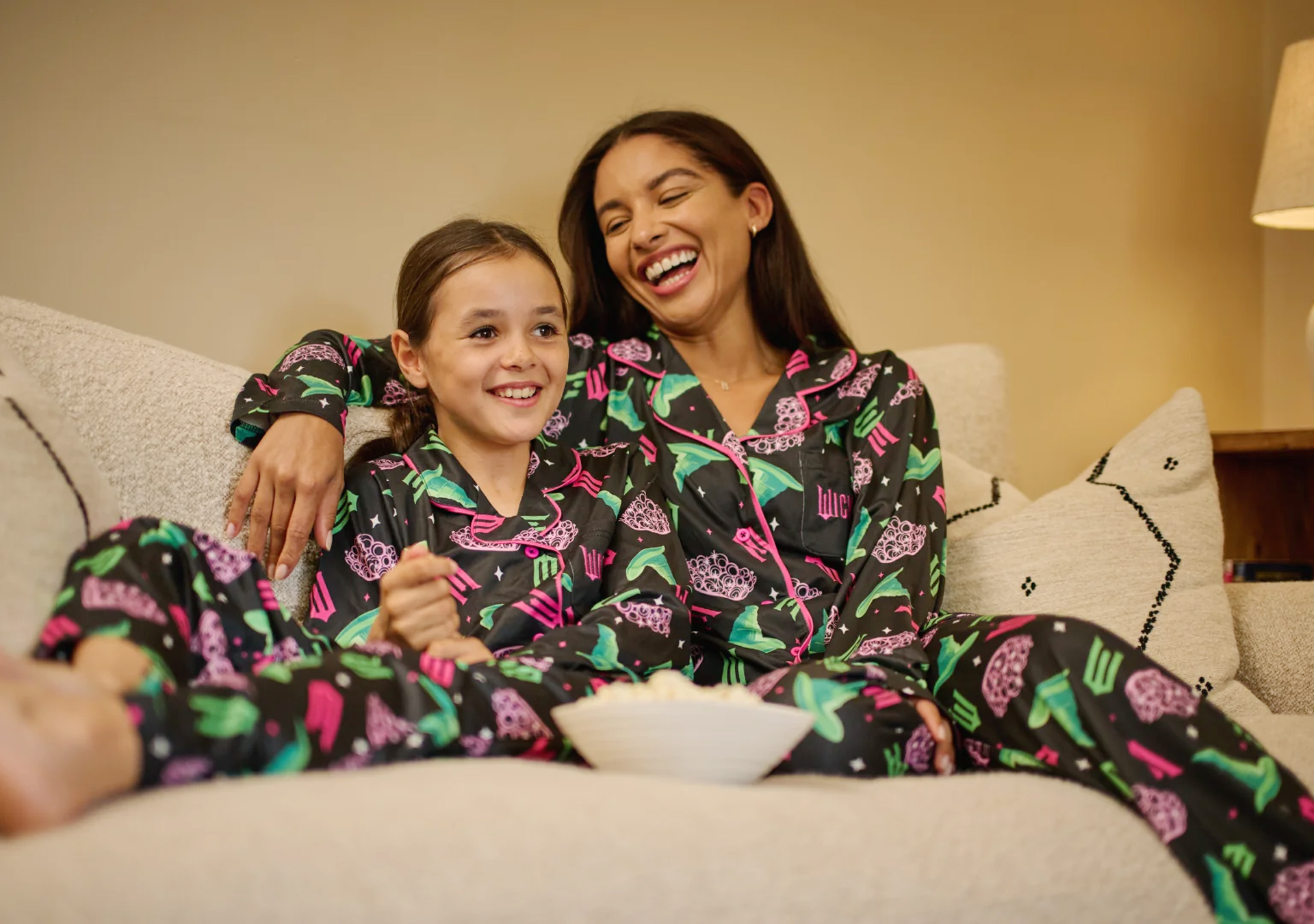
Founded by parents frustrated with the lack of affordable branded clothing for kids, Character.com embraces its "Wear A Smile" ethos, aiming to bring joy and fun through character-branded clothing for toddlers, kids, and teenagers without breaking the bank.
In this role, I tackled the challenge of creating engaging and effective marketing materials that captures attention while differentiating the brand from competitors and maintaining a balance between creativity and the business's core values.
I collaborated with the Character.com in-house team led by Emma Wilkins, focusing on creating assets such as UX icons, landlord flyers, brand toolkits and store signage, specifically designed for print and digital commercial use.
These brand toolkits highlights how considered shape language, colour choices, and personality-driven design decisions that visually identify (not explain) can strengthen storytelling and engagement. Balancing individuality and consistency, made each toolkit application suitable for use within a shared visual environment
Born from
Character.com — "Everyone loves character clothing. Even big kids who should know better. Founded by parents, we get it. Kitting them out in the latest gear isn’t cheap. And if it’s the wrong one, cue the howls of outrage. Which is why we take care to source the styles they want to be seen in, at a price that won’t break the bank."
My role was to help position Character.com at the forefront of the market by creating cohesive print and digital visual assets that effectively utilise their brand guidelines and toolkit.
Services
Print & Digital Artwork | Branding | Print Design | Illustration
Sectors
Commercial Messaging | Retail Stores | Clothing Brand | Brand Participation
The Client
Character.com, Swansea, South Wales, UK
The Team
Ben Ballantyne, Creative Designer | Emma Wilkins, Brand Manager
Founded by parents frustrated with the lack of affordable branded clothing for kids, Character.com embraces its "Wear A Smile" ethos, aiming to bring joy and fun through character-branded clothing for toddlers, kids, and teenagers without breaking the bank.
In this role, I tackled the challenge of creating engaging and effective marketing materials that captures attention while differentiating the brand from competitors and maintaining a balance between creativity and the business's core values.
These brand toolkits highlights how considered shape language, colour choices, and personality-driven design decisions that visually identify (not explain) can strengthen storytelling and engagement. Balancing individuality and consistency, made each toolkit application suitable for use within a shared visual environment
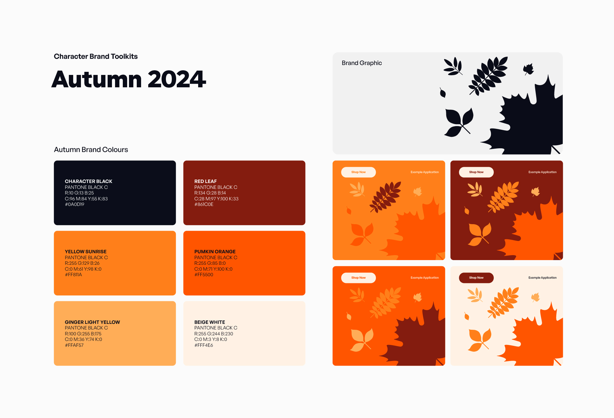
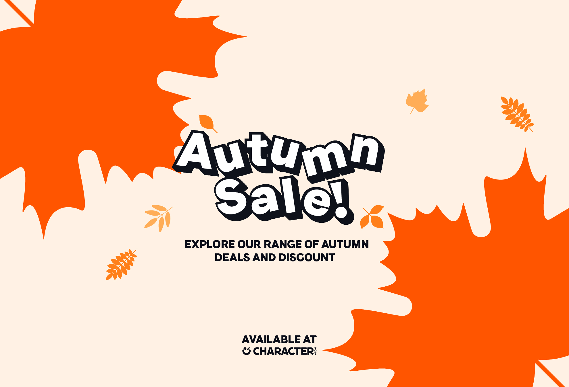
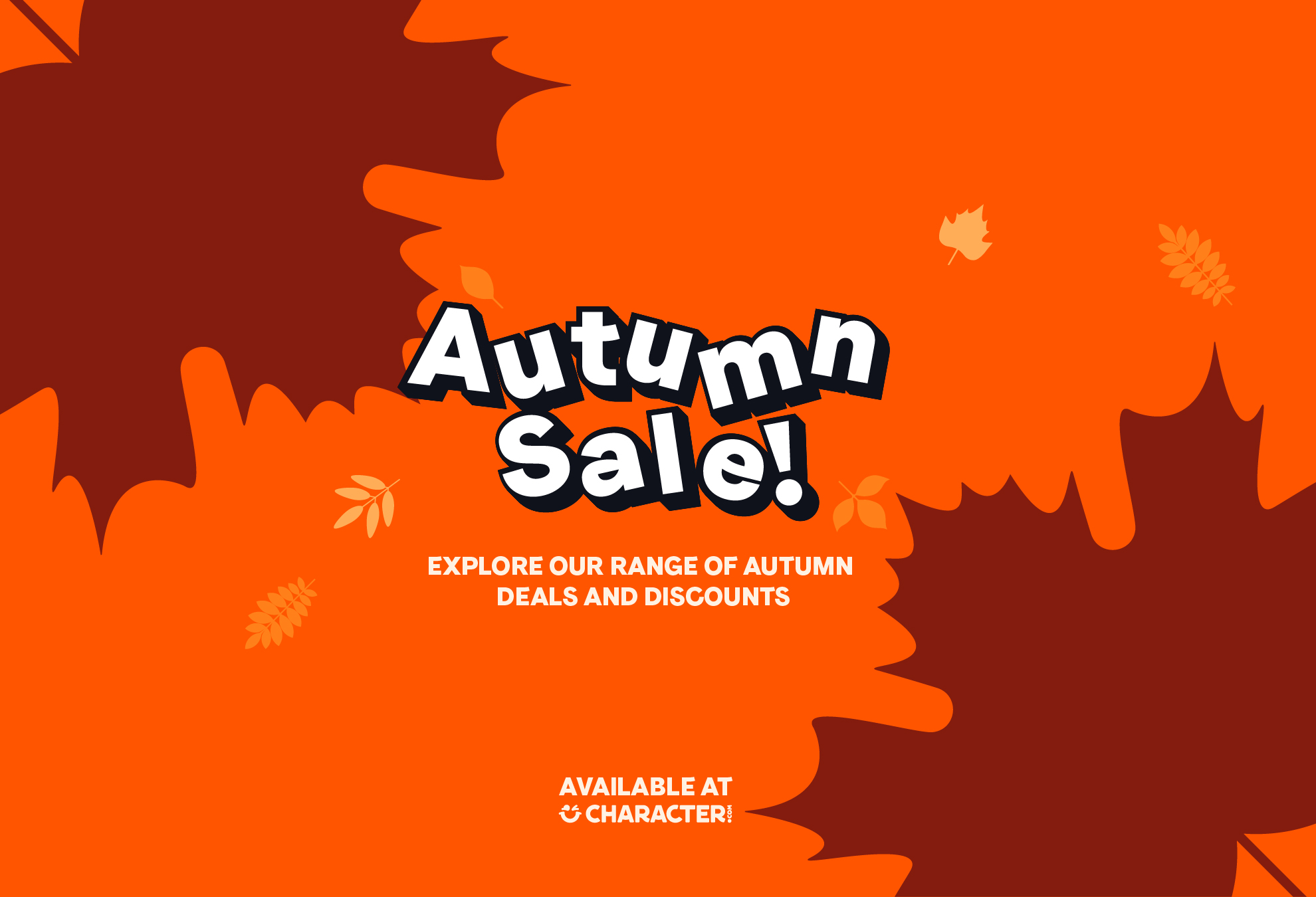
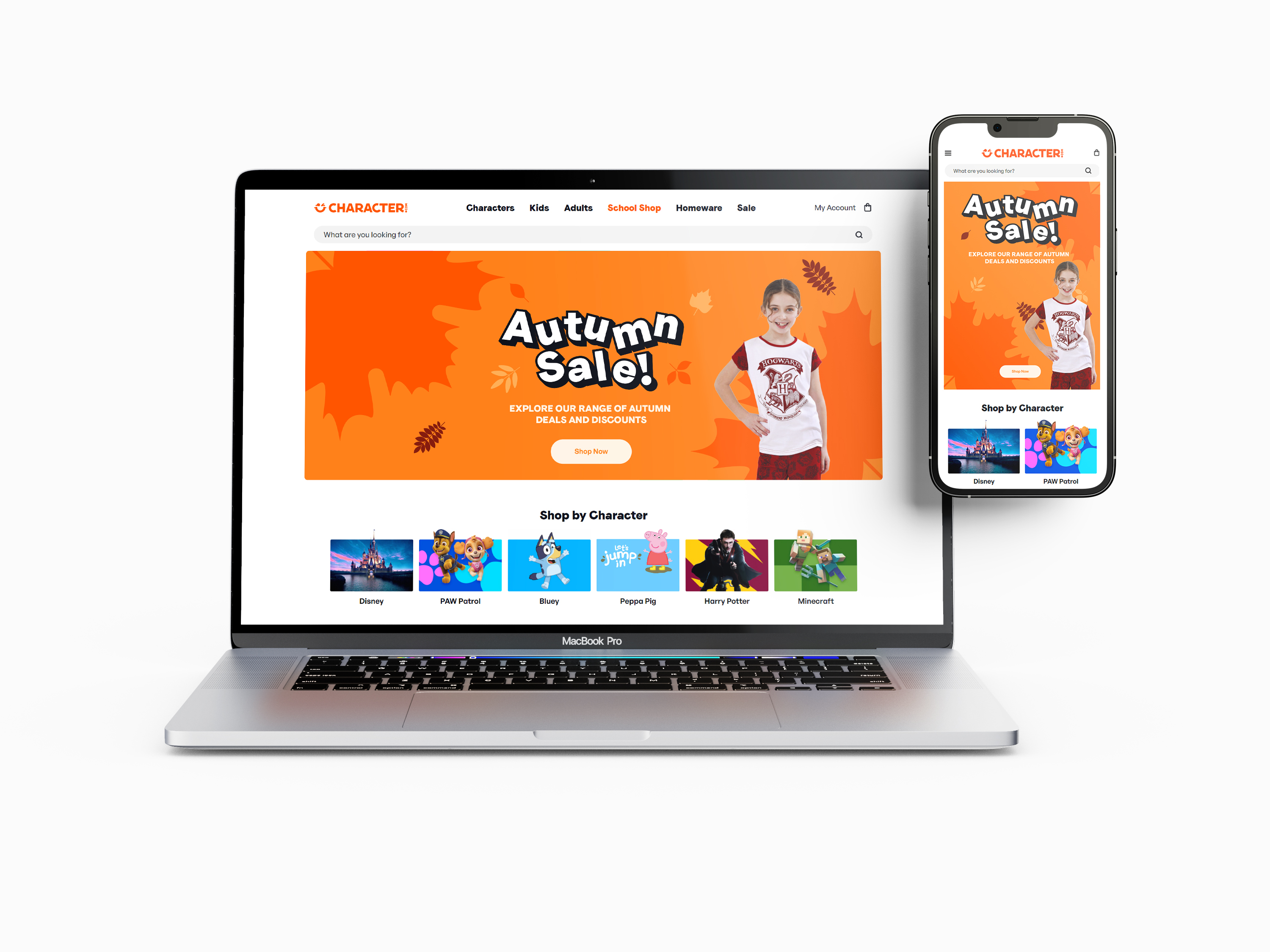
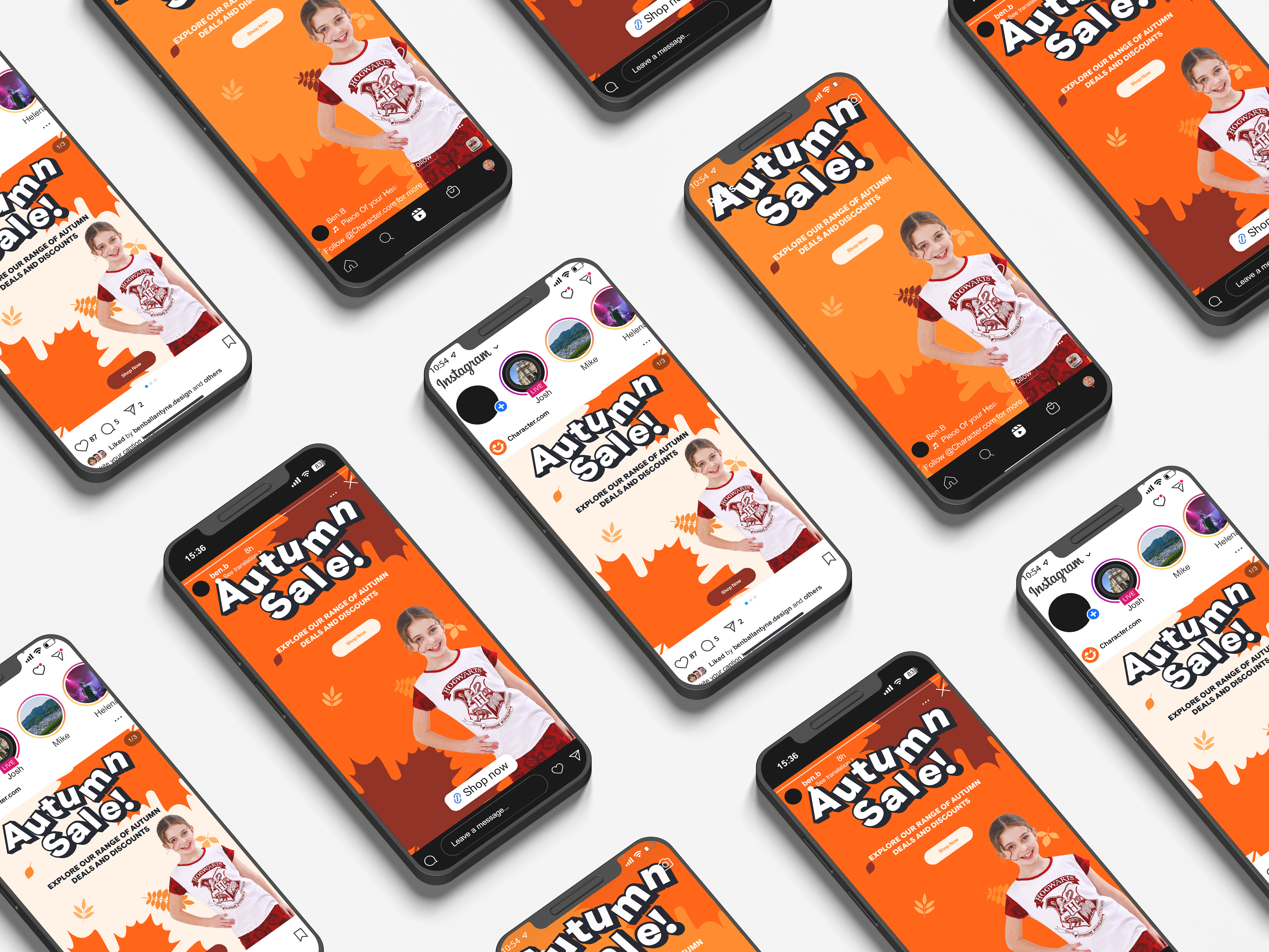
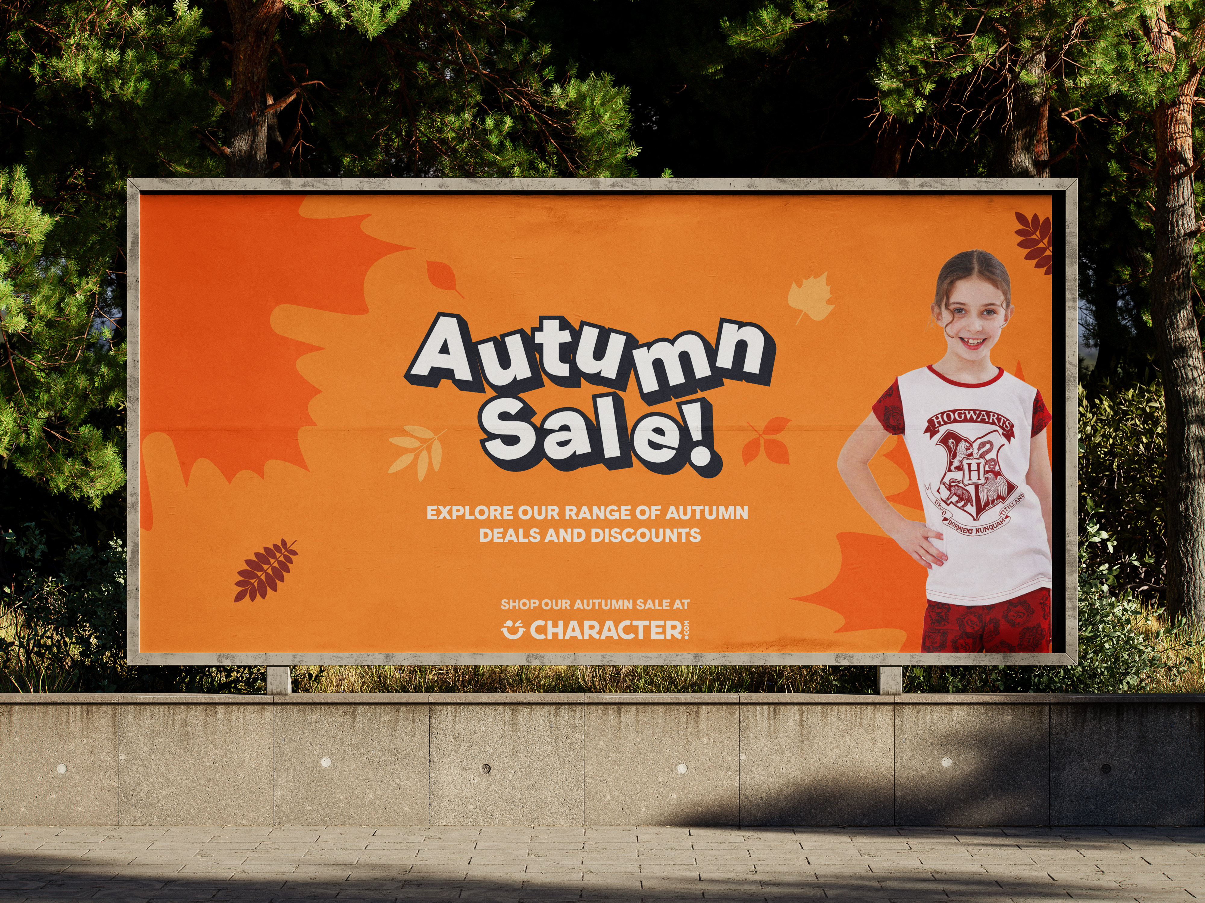
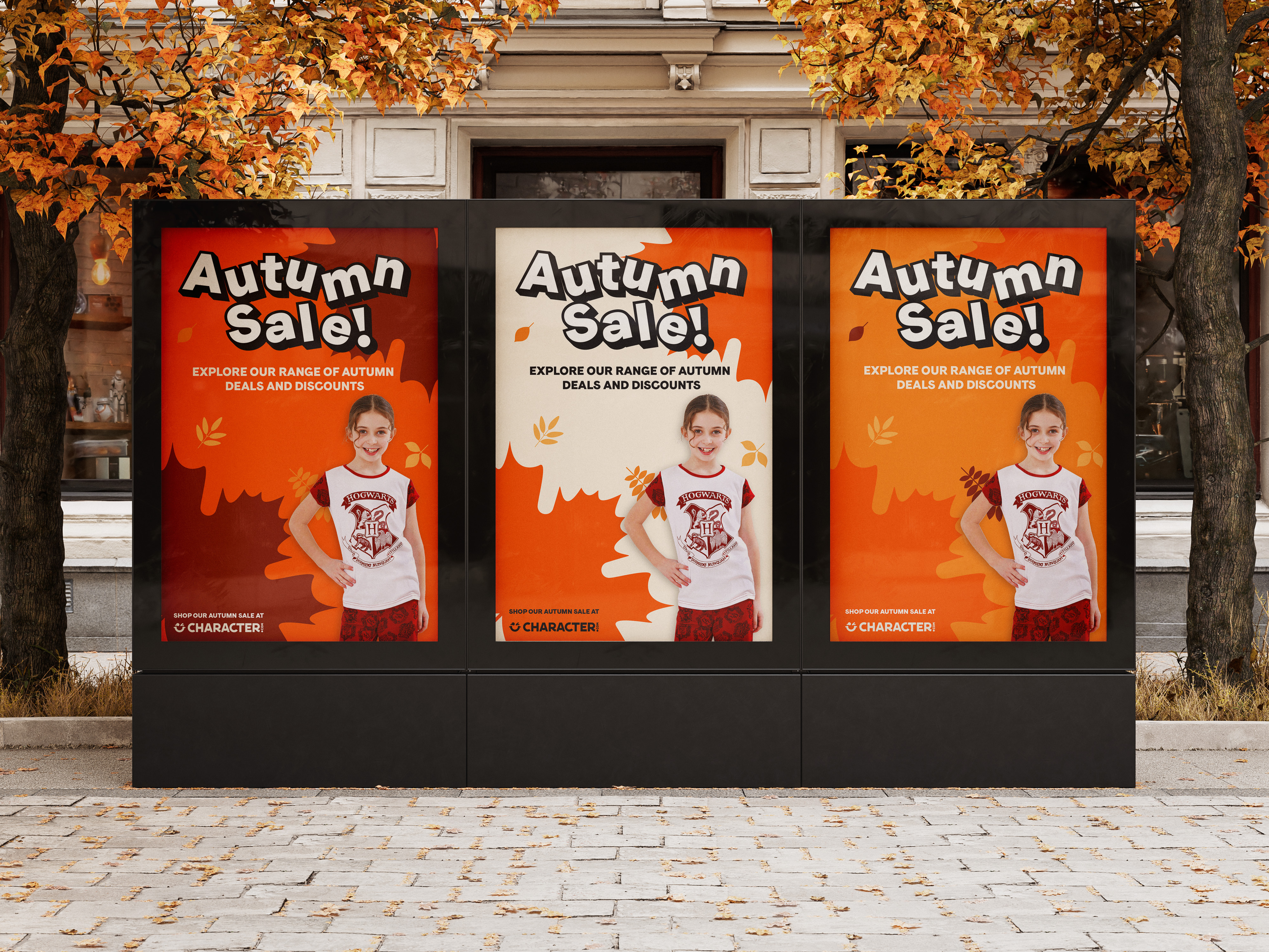
I created an autumn asset pack for Character.com's brand toolkits, which includes at least six theme-specific colours and 5 to 7 design assets. The primary typeface is Faro Display Lucky for its playful look, conveying joy with every word, while General Sans offers a modern, easy-to-read style.
This pack emphasizes autumn colours and icons, aligning with Character's brand guidelines. The marketing materials promote autumn deals and can be used online and in print.


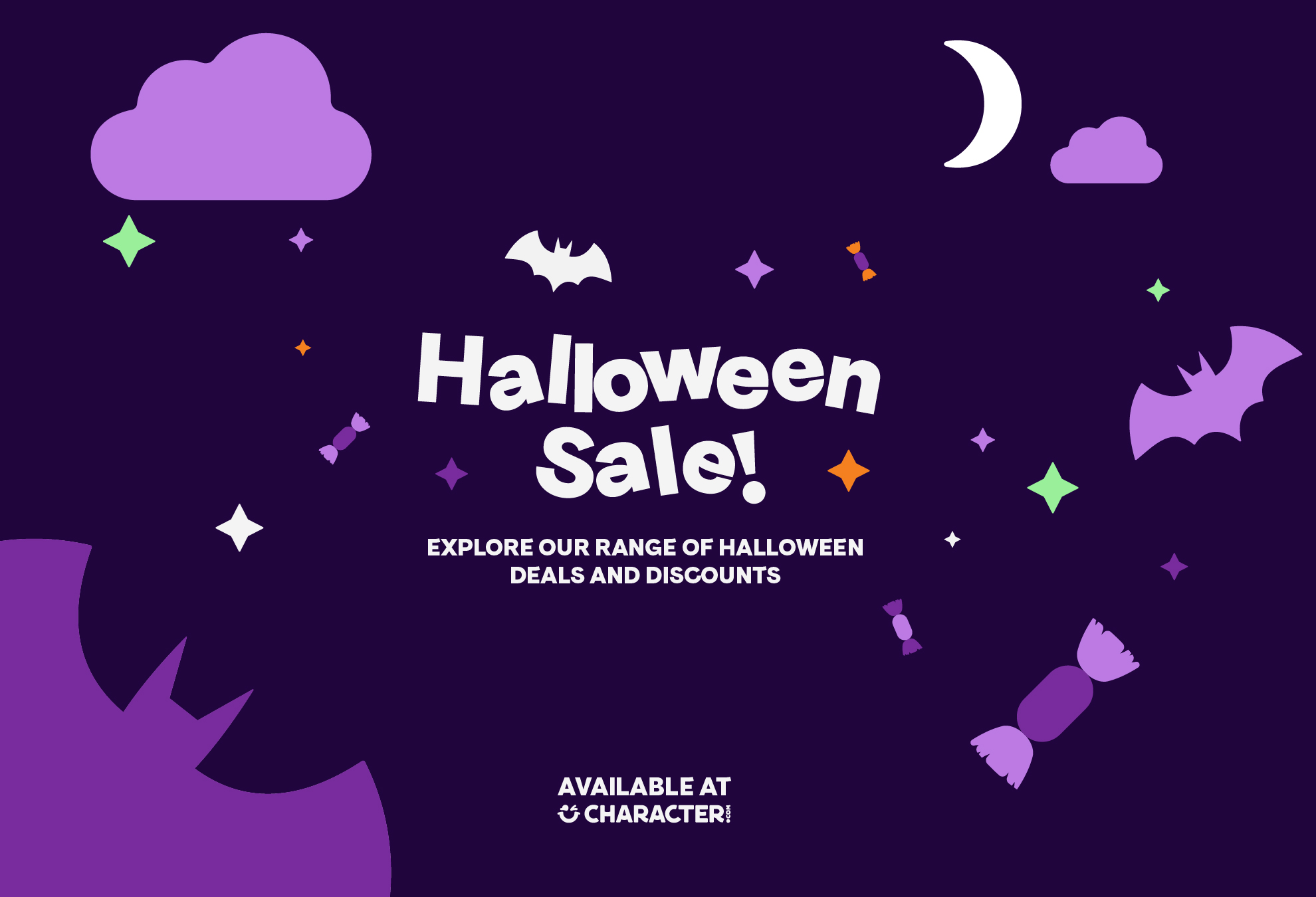
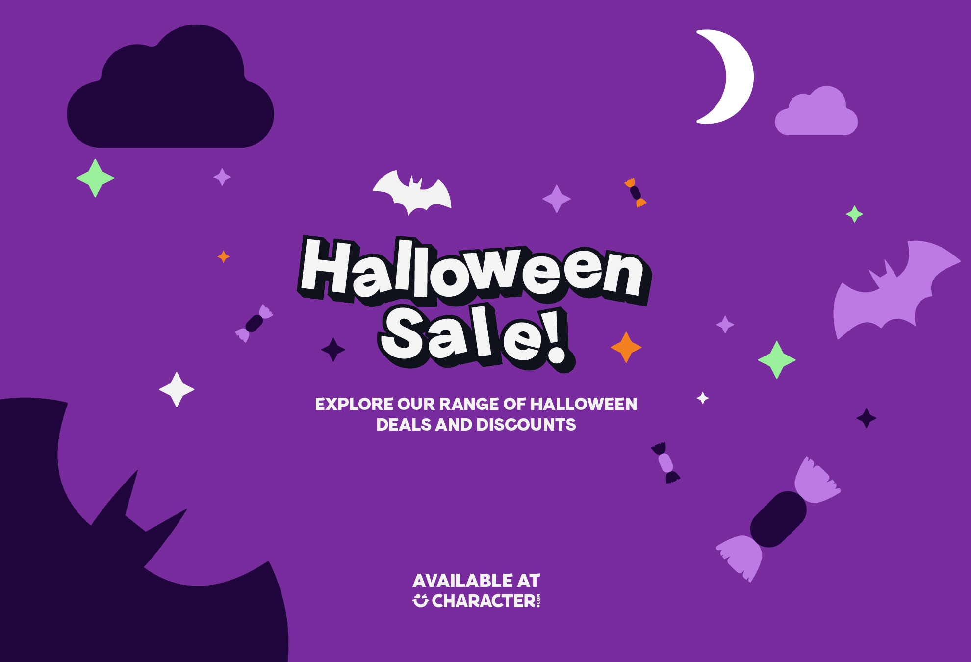
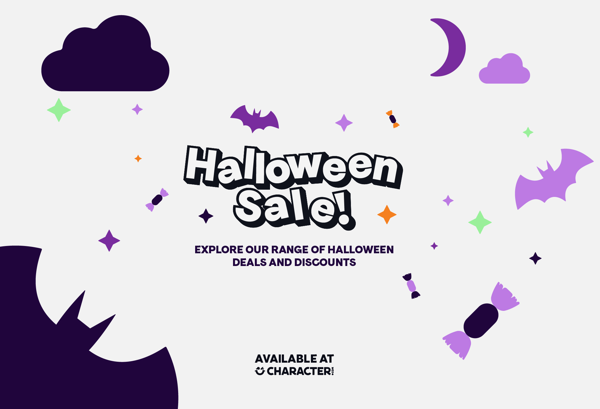
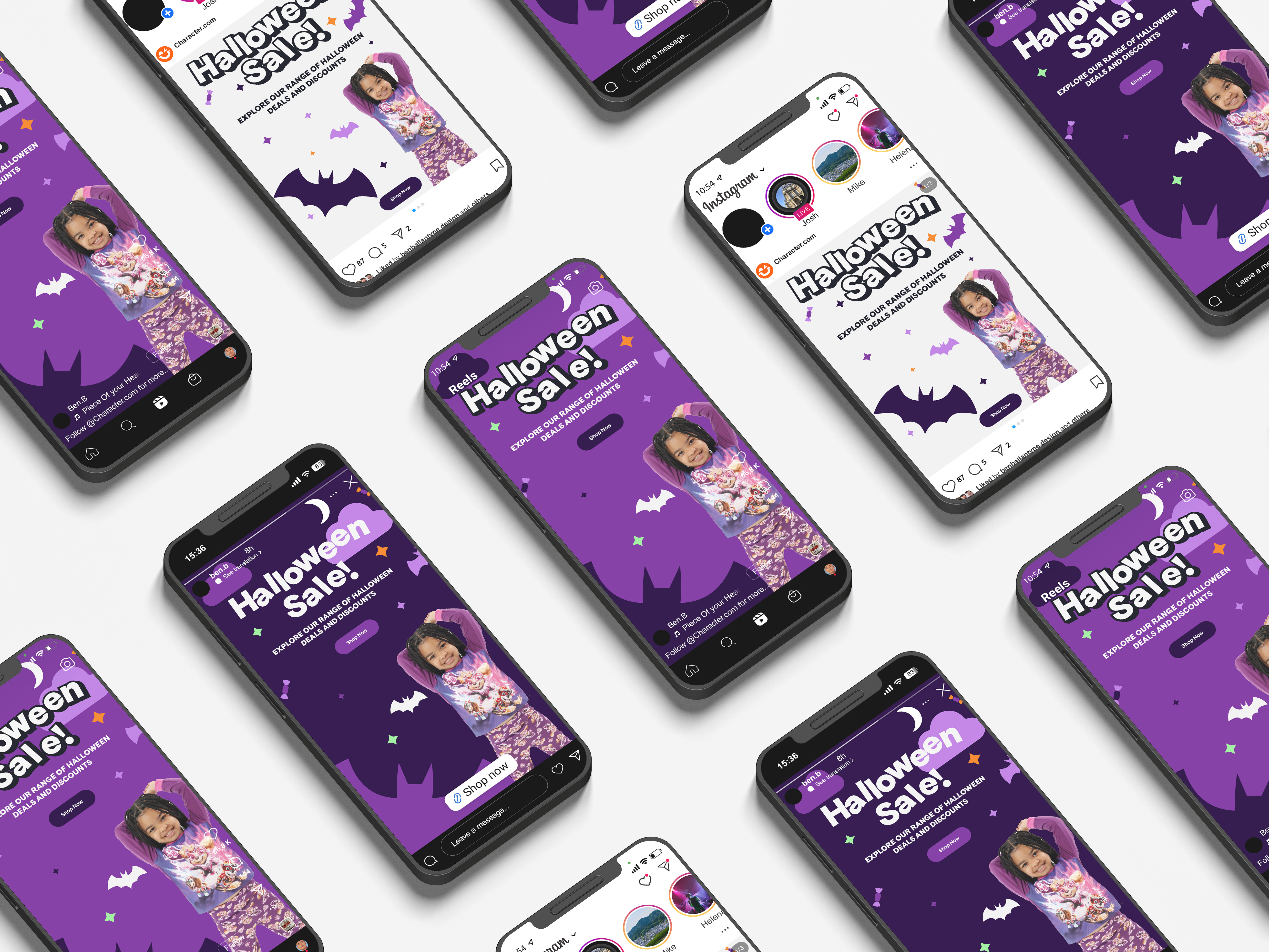
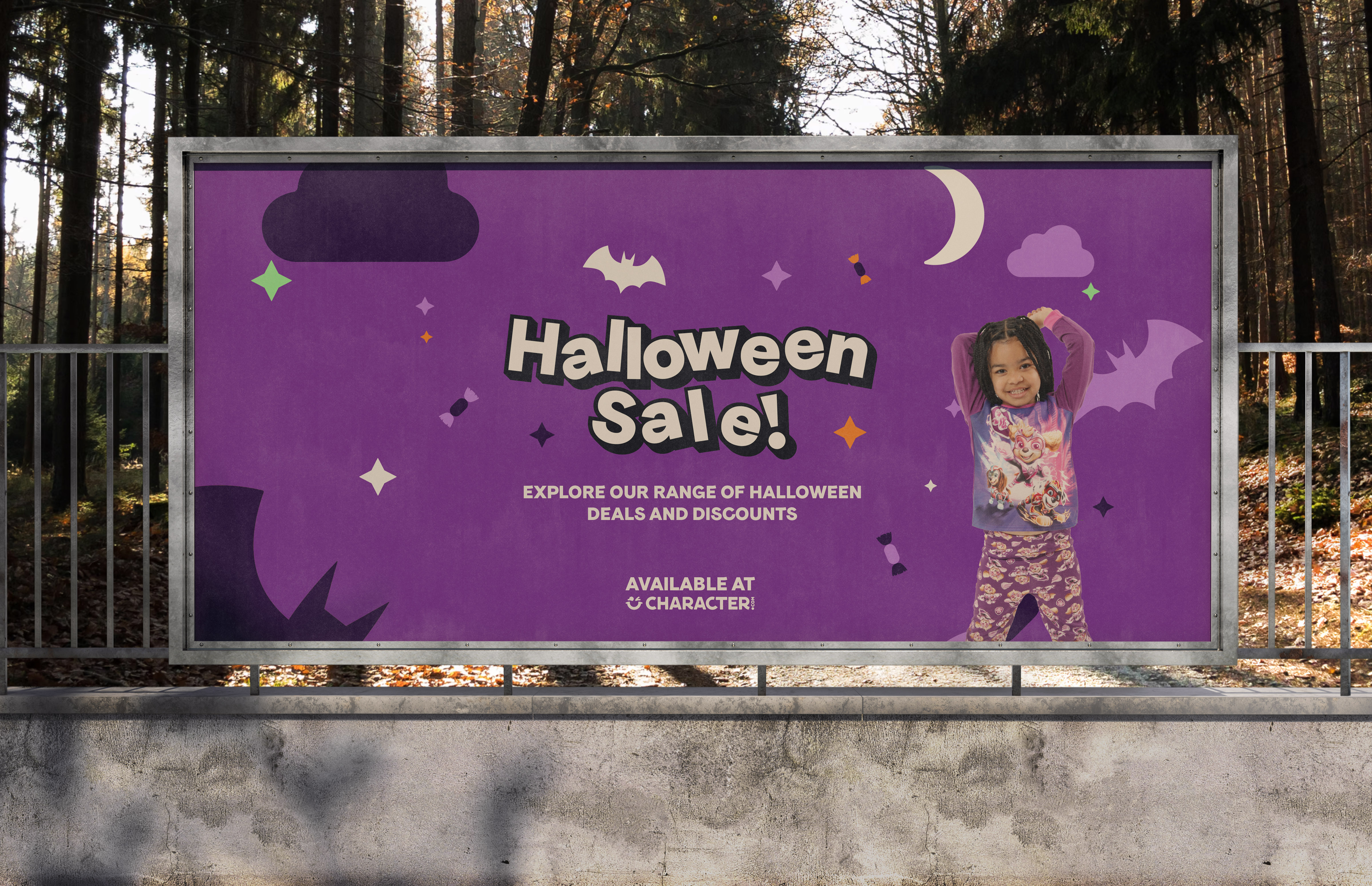
The Halloween asset pack builds on the previous one and adds a fun twist with a seventh colour—green! This change ties in with the exciting cinematic releases of "Wicked" and "Beetlejuice." I aimed to use playful Halloween icons like ghosts, bats, and vibrant purple tones to create a spooky yet enjoyable atmosphere. It's all about capturing that fun Halloween spirit!


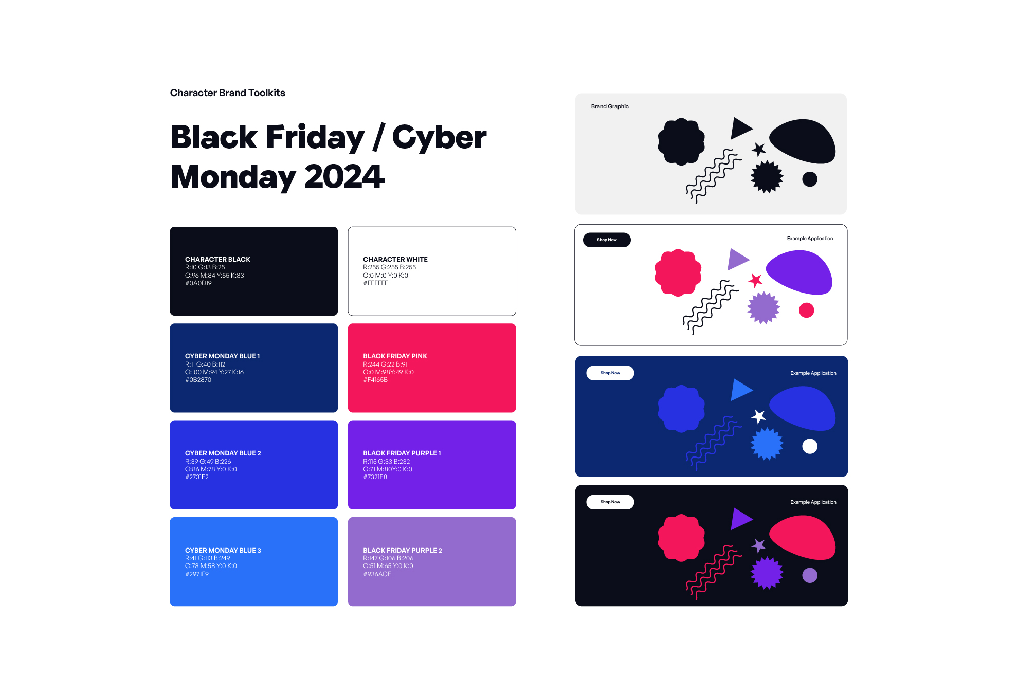
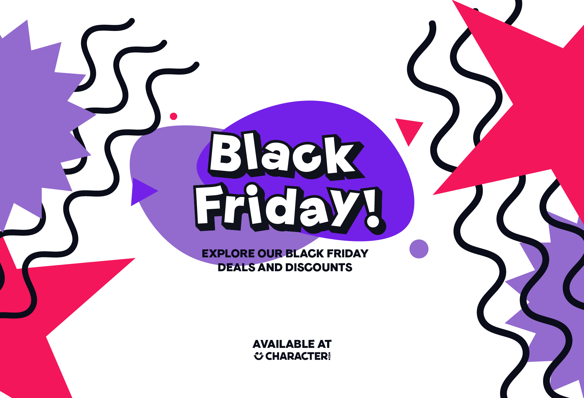
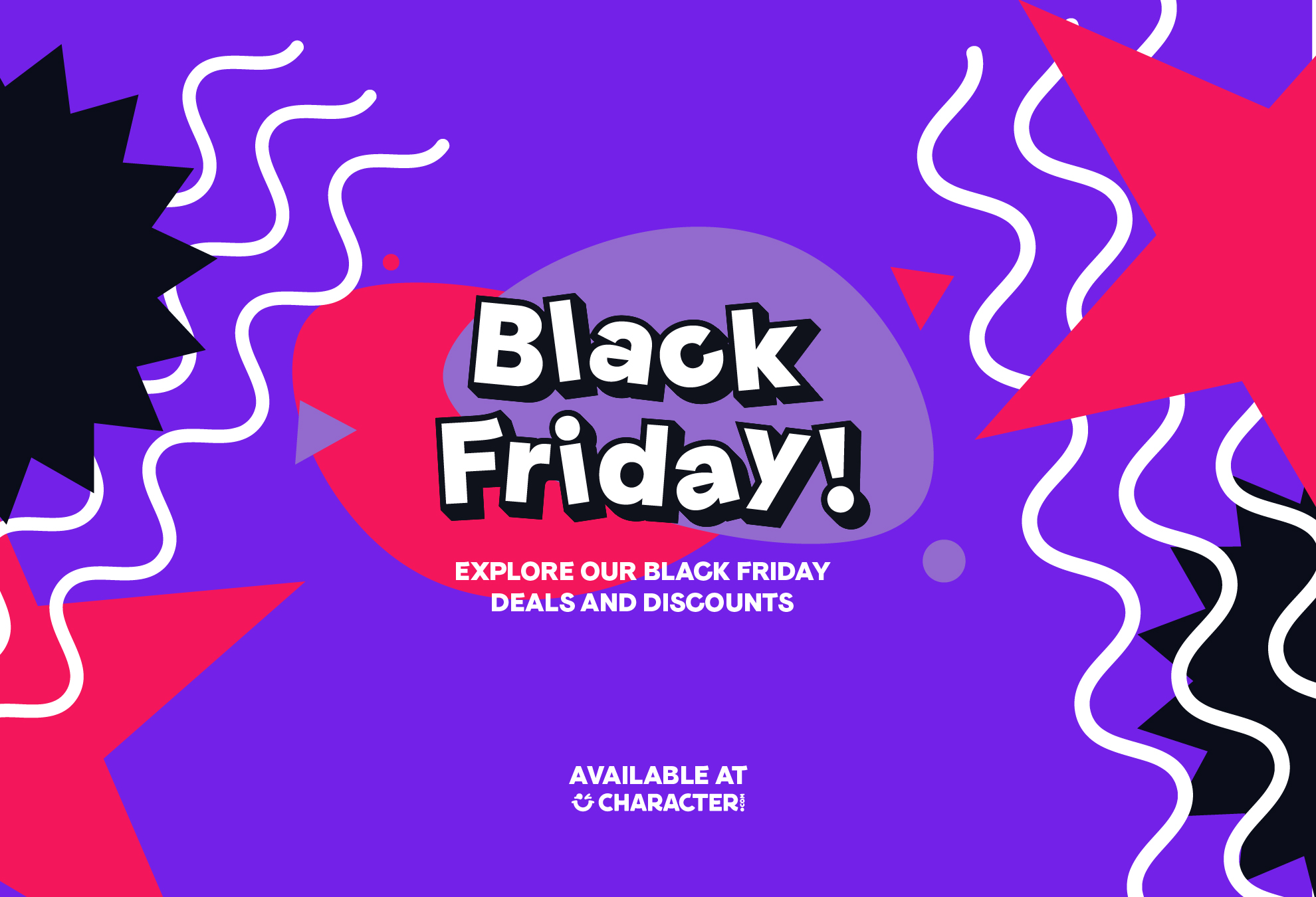
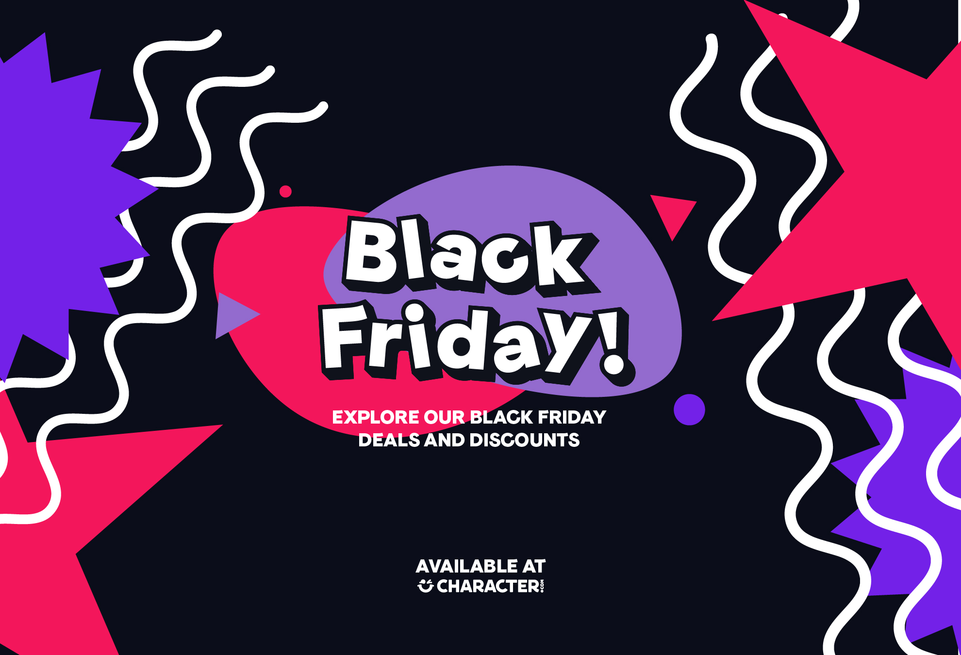
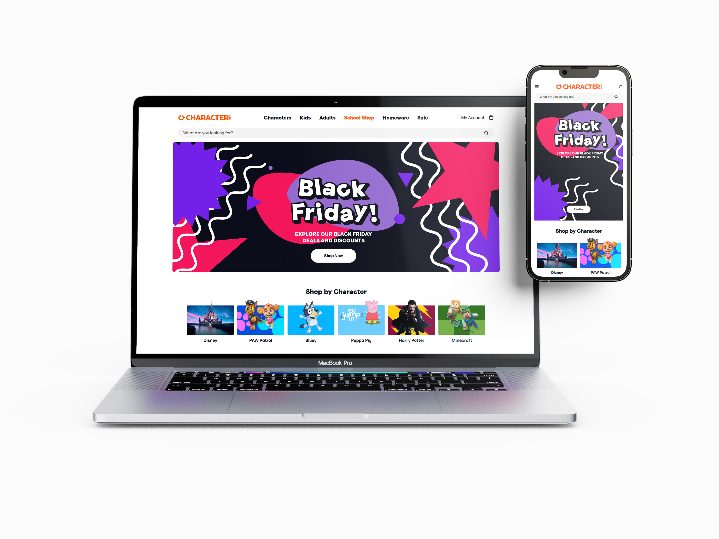
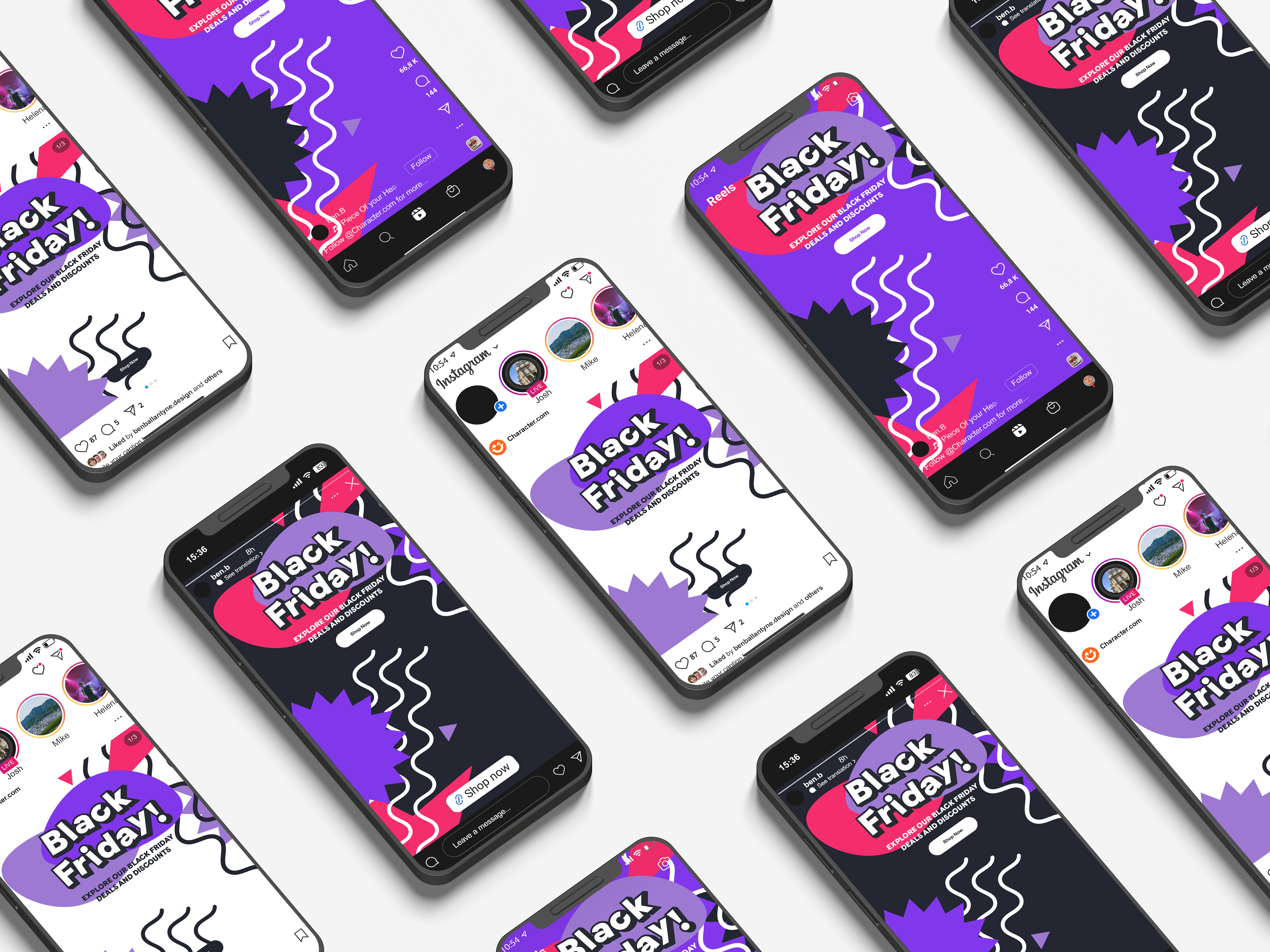
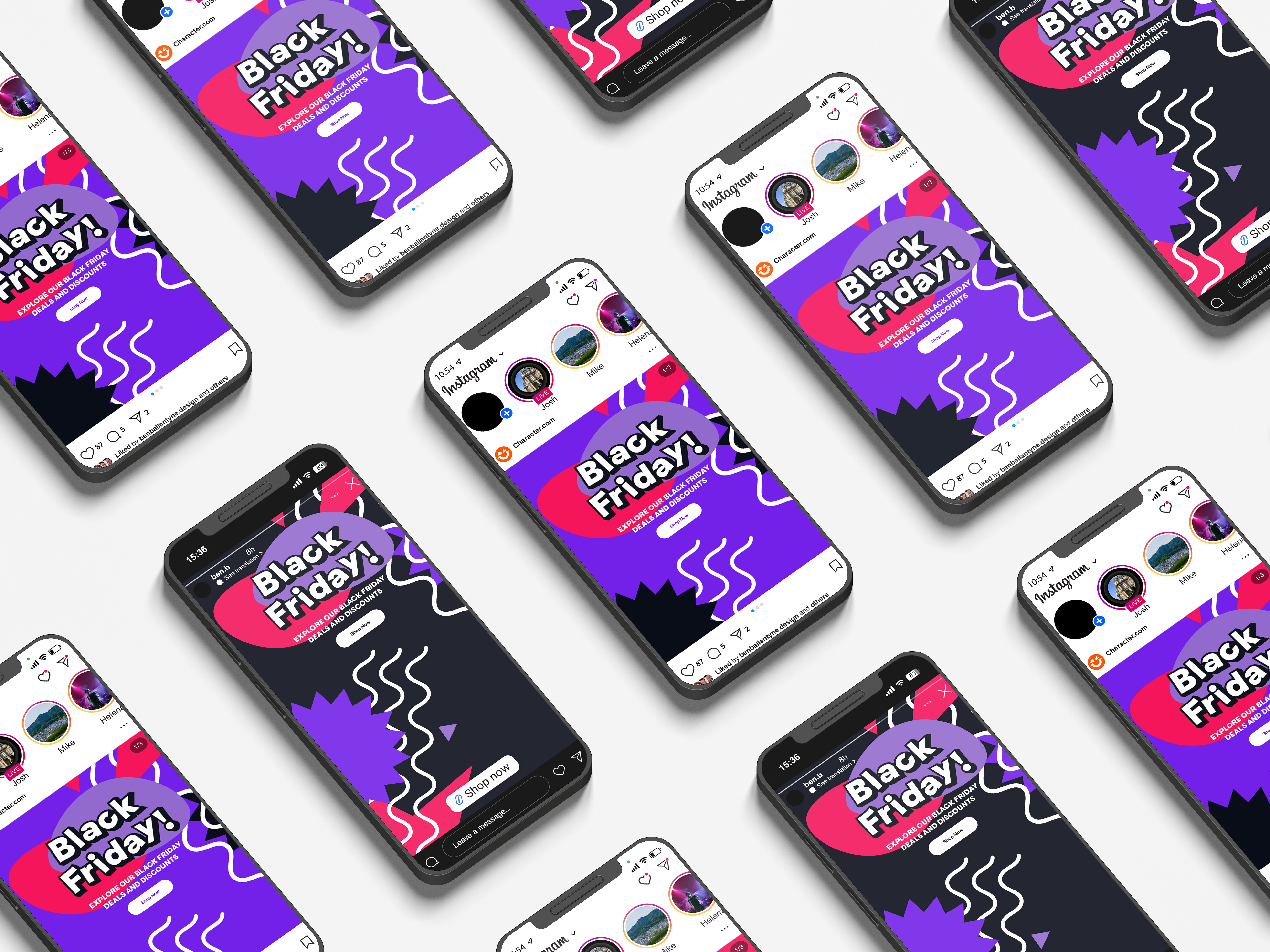
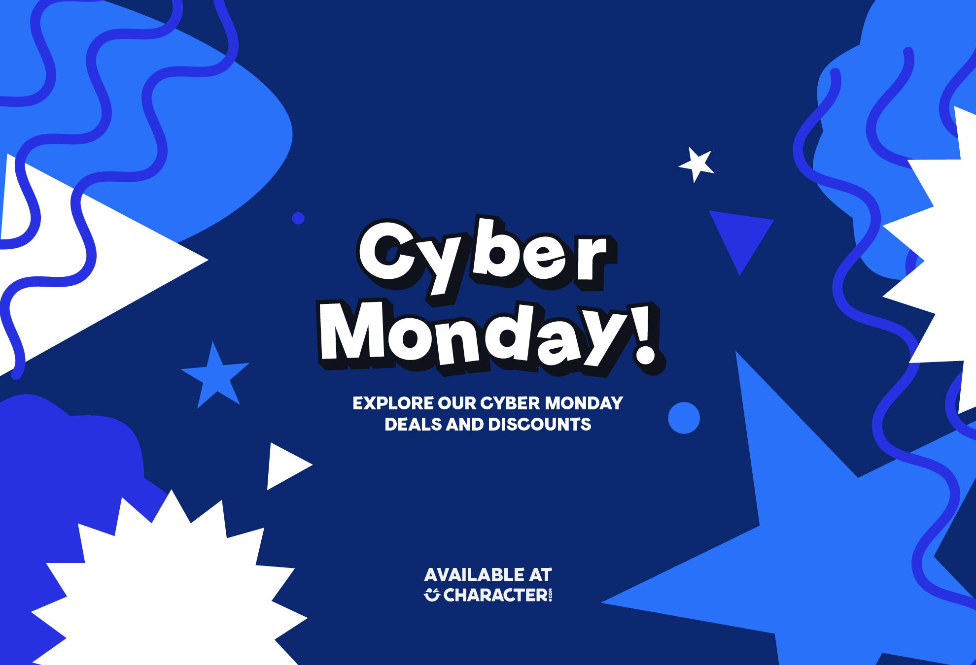
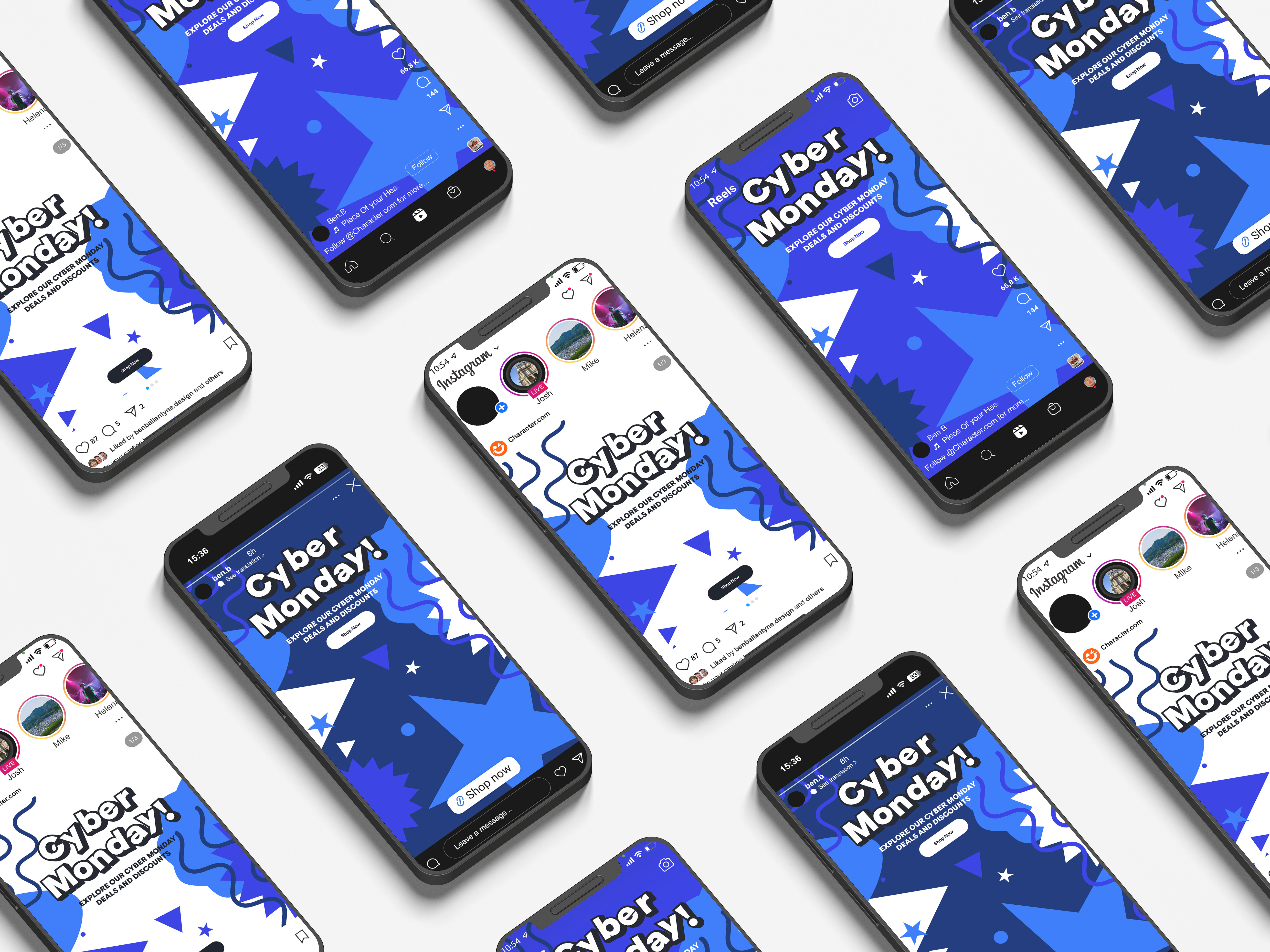
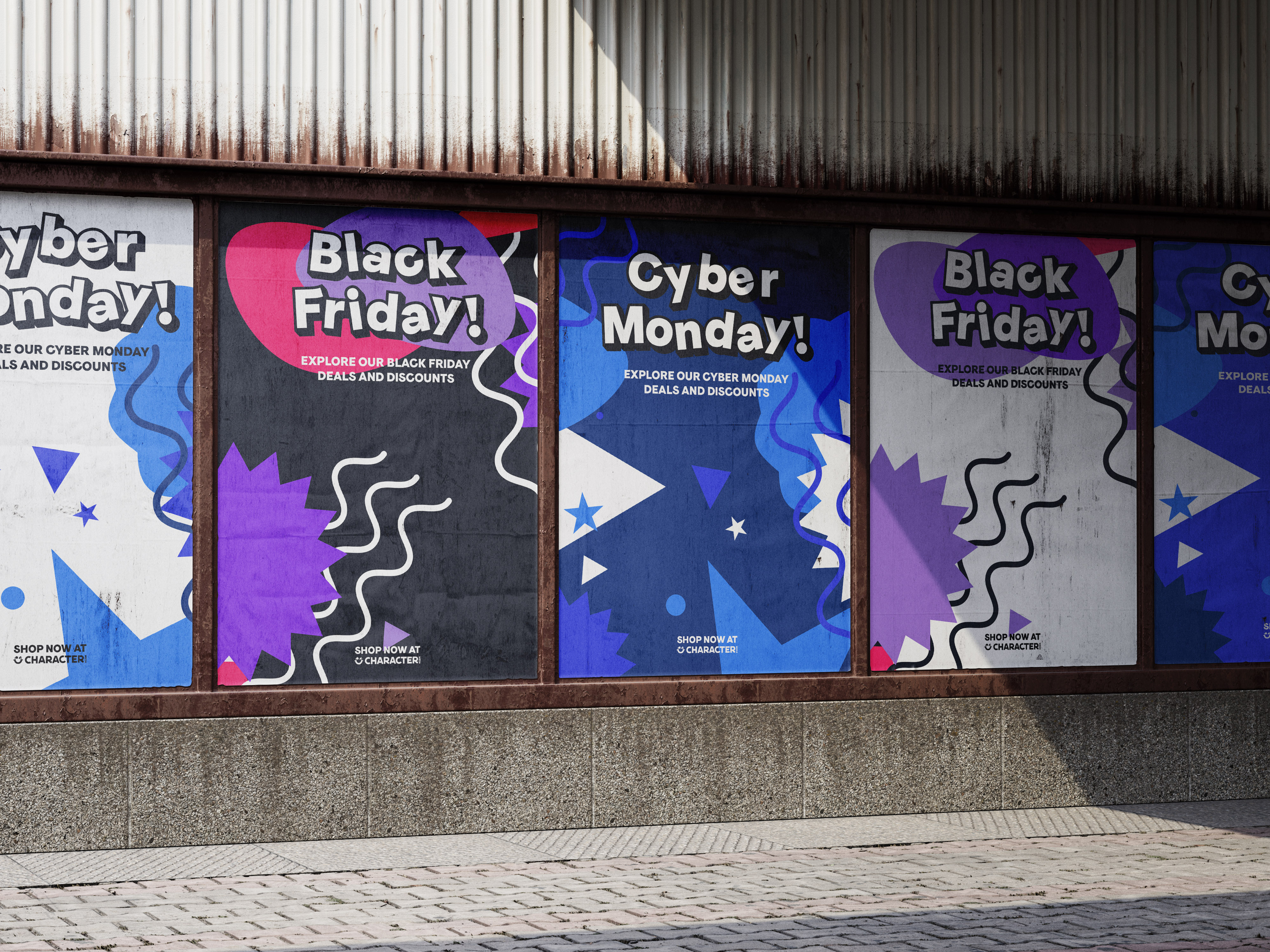
The Black Friday toolkit was designed to deliver bold, conversion-focused assets for a key retail period while staying true to Character.com’s playful identity. A system of modular components allowed creative to scale across digital and in-store channels with ease.
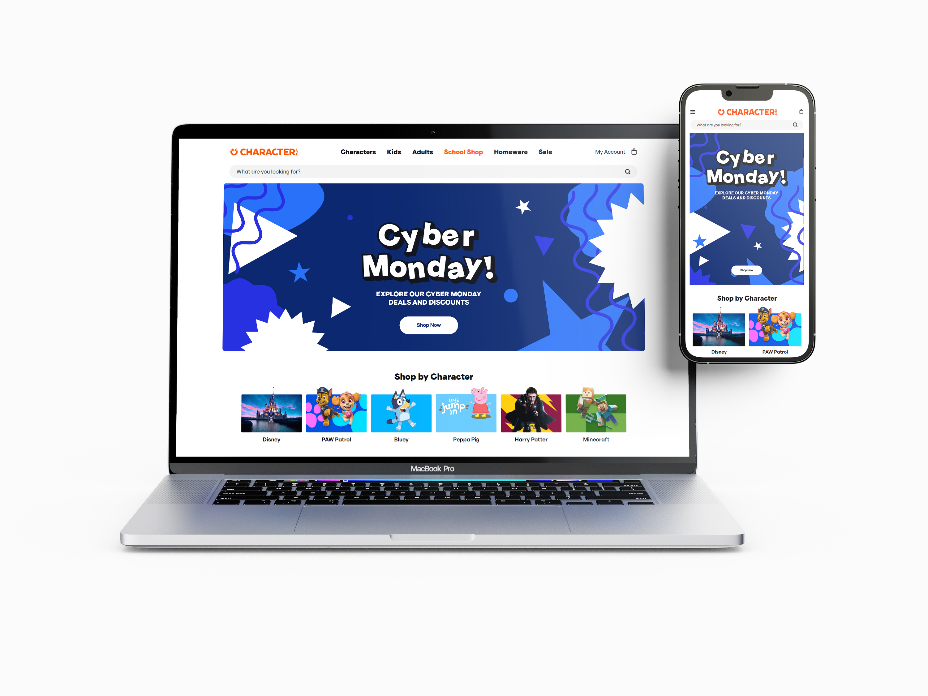


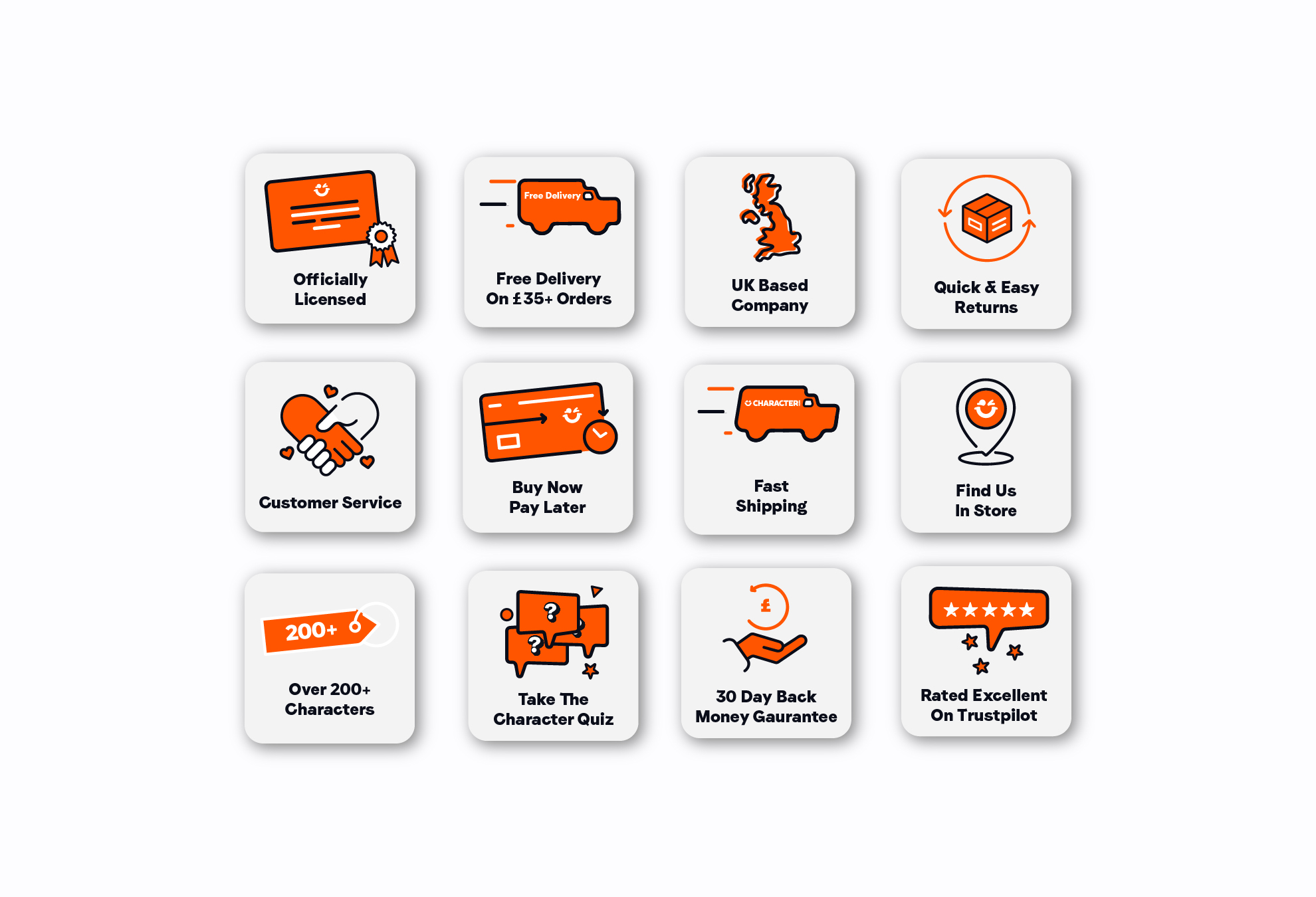
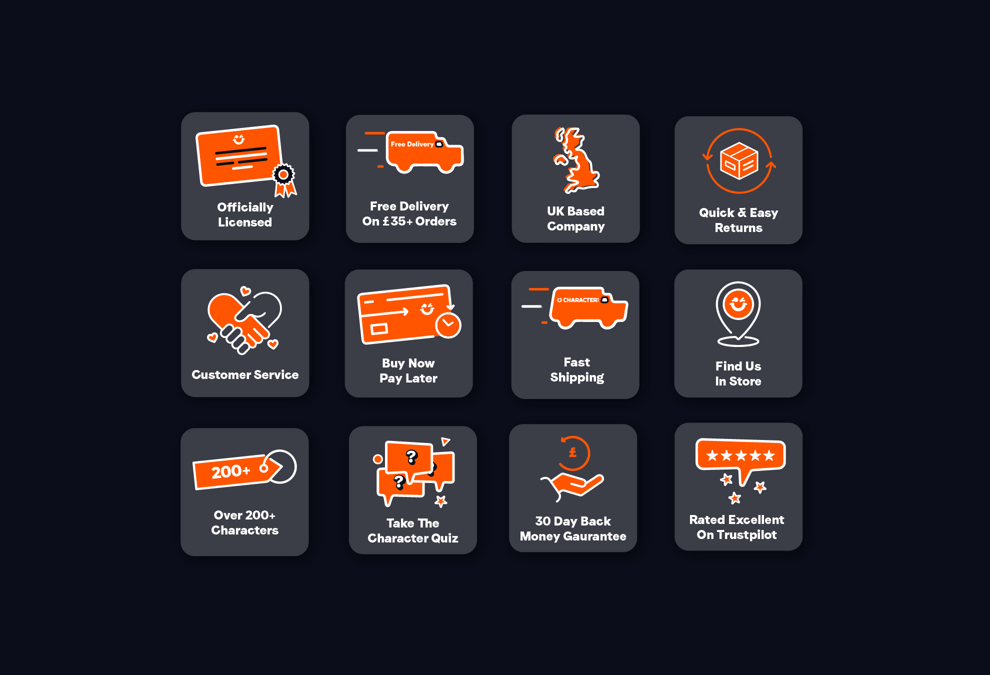
I was assigned to create UX icons for the Character.com e-commerce website. The design of these icons incorporates key brand elements, including the use of Character Orange and Black colours, Faro Sans for the text, and the implementation of the Character smile while maintaining appropriate spacing with other visual elements.
Additionally, some icons are rotated at a 6-degree angle to enhance their friendly and expressive appearance.
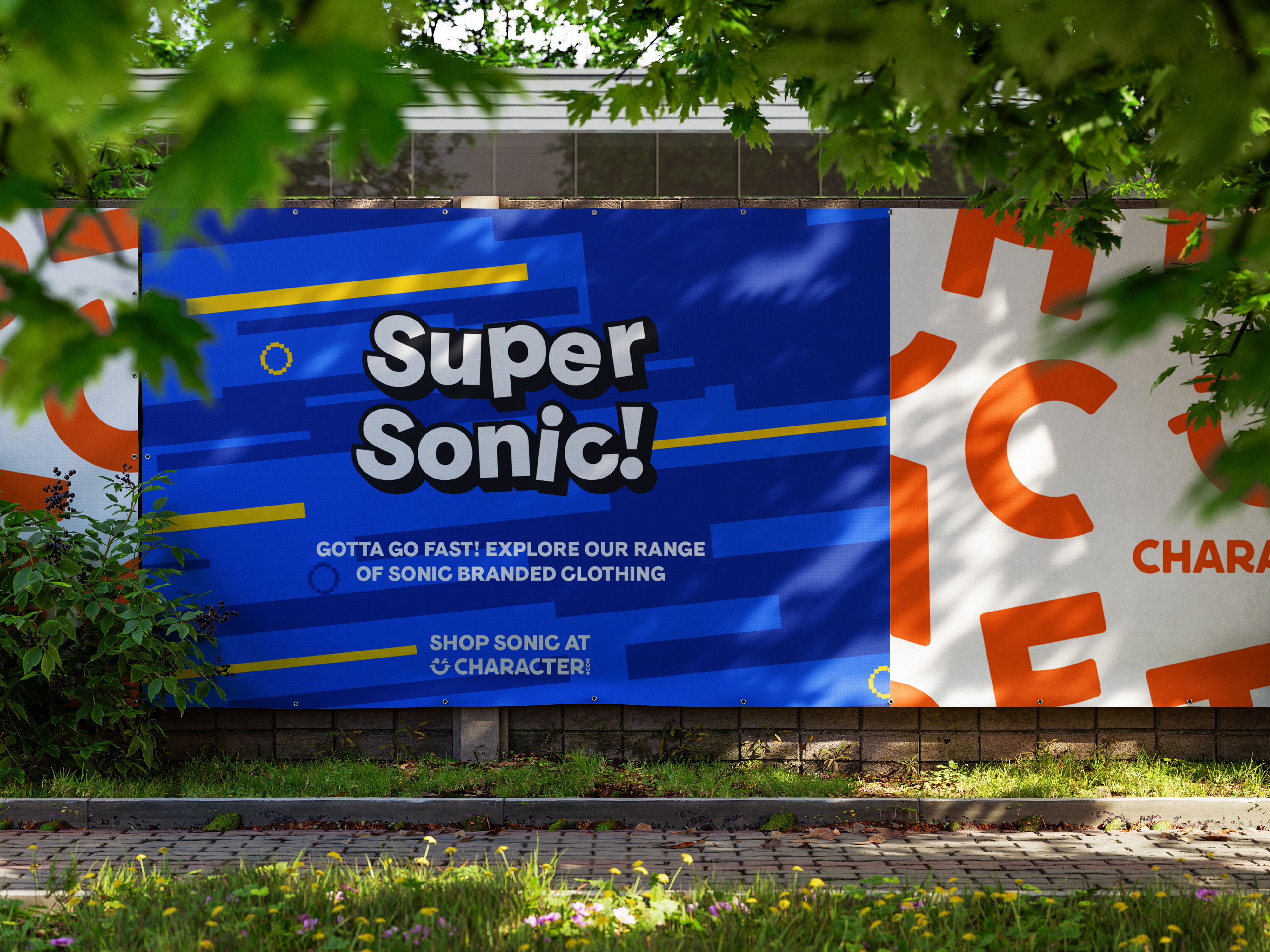
I created a flyer for prospective retail unit landlords using the Character.com brand assets. The flyer should effectively communicate Character.com's requirements for new retail locations and align with their entry into the physical retail sector. To effectively represent the brand's essence professionally, it features logos, graphic elements, retail store imagery, and typography that align with Character.com's branding.


Working with the in-house team and the brand guidelines set by Toward Studio, the design work and collaborative efforts contributed towards a refined and cohesive visual outcome that remains faithful to the established brand identity.
"Having worked with Ben on several projects, I can confidently say that he is both professional and friendly. He worked for us during a pivotal period when we refined our brand and developed new artwork to align with our existing brand guidelines. One of Ben’s strongest qualities is his attentiveness to feedback; he consistently puts in the effort to understand our ideas and bring them to life, executing his projects to a high standard."
A noticeable boost in click-through rates, contributed by visually compelling email content, clear calls to action, and audience-focused brand messaging.
Email campaigns and flows are driving stronger engagement, with more opens, higher clicks, and increased purchases across the board.
The new brand is now fit for purpose for the recently launched retail store concept, with 5 new stores opened since launch, and more planned for the next 12 months.
Print and digital point-of-sale artwork was proven to be effective in engaging with the primary target demographics for Character.com(children, teenagers, and parents)